- Introduction
- 1. Introduction to Quantitative Analysis
- 2. Descriptive Statistics
- 3. T-test for Difference in Means and Hypothesis Testing
- 4. Bivariate linear regression models
- 5. Multiple linear regression models
- 6. Assumptions and Violations of Assumptions
- 7. Interactions
- 8. Panel Data, Time-Series Cross-Section Models
- 9. Binary models: Logit
- 10. Frequently Asked Questions
- 11. Optional Material
- 12. Datasets
- 13. R Resources
- 14. References
- Published with GitBook
5. Multiple linear regression models
5.1 Seminar
Setting a Working Directory
Before you begin, make sure to set your working directory to a folder where your course related files such as R scripts and datasets are kept. We recommend that you create a PUBLG100 folder for all your work. Create this folder on N: drive if you're using a UCL computer or somewhere on your local disk if you're using a personal laptop.
Once the folder is created, use the setwd() function in R to set your working directory.
| Recommended Folder Location | R Function | |
|---|---|---|
| UCL Computers | N: Drive | setwd("N:/PUBLG100") |
| Personal Laptop (Windows) | C: Drive | setwd("C:/PUBLG100") |
| Personal Laptop (Mac) | Home Folder | setwd("~/PUBLG100") |
After you've set the working directory, verify it by calling the getwd() function.
getwd()
Now download the R script for this seminar from the "Download .R Script" button above, and save it to your PUBLG100 folder.
library(foreign) # to load foreign file formats
library(Zelig) # to predict from regression output and present uncertainty
library(texreg) # to plot regression output to screen or file
Warning: package 'texreg' was built under R version 3.2.3
library(dplyr) # to manipulate data (load this library last!)
rm(list = ls())
Loading, Understanding and Cleaning our Data
Today, we load the full standard (cross-sectional) data set from the Quality of Government Institute. This is a great data source for comparativist political science research. The codebook is available from their main website. You can also find time-series and cross-section data sets on this page.
# load data set in Stata format
world.data <- read.dta("http://uclspp.github.io/PUBLG100/data/qog_std_cs_jan15.dta")

# check the dimensions of the data set
dim(world.data)
[1] 193 2037
The data set contains a huge number of variables. We will therefore select a subset that we want to work with. We are interested in political stability. Specifically, we want to find out what predicts the level of political stability. Therefore, pol.stability is our dependent variable (also called response variable). We will also select an ID variable that identifies each row (observation) in the data set uniquely: cname which is the name of the country. Potential predictors (independent variables) are:
lp_lat_abstis the distance to the equator which we rename intolatitudedr_ingis an index for the level of globalization which we rename toglobalizationti_cpiis Transparency International's Corruptions Perceptions Index, renamed toqual.inst(larger values mean better quality institutions, i.e. less corruption)
Our dependent variable:
wbgi_psewhich we rename intopol.stability(larger values mean more stability)
# select 5 variables from world.data and rename them
world.data <- select(world.data,
                     country = cname,
                     pol.stability = wbgi_pse,
                     latitude = lp_lat_abst,
                     globalization = dr_ig,
                     qual.inst = ti_cpi)
The function summary() lets you summarize data sets. We will look at the data set now. When the data set is small in the sense that you have few variables (columns) then this is a very good way to get a good overview. It gives you an idea about the level of measurement of the variables and the scale. country, e.g., is a character variable as opposed to a number. Countries do not have any order, so the level of measurement is categorical. If you think about the next variable, political stability, and how one could measure it you know there is an order implicit in the measurement: more or less stability. From there, what you need to know is whether the more or less is ordinal or interval scaled. Checking pol.stability you see a range from roughly -3 to 1.5. The variable is numerical and has decimal places. This tells you that the variable is at least interval scaled. You will not see ordinally scaled variables with decimal places. Using these heuristics look at the other variables.
# summarize the data set
summary(world.data)
   country          pol.stability         latitude      globalization
 Length:193         Min.   :-3.10637   Min.   :0.0000   Min.   :24.35
 Class :character   1st Qu.:-0.72686   1st Qu.:0.1444   1st Qu.:45.22
 Mode  :character   Median :-0.01900   Median :0.2444   Median :54.99
                    Mean   :-0.06079   Mean   :0.2865   Mean   :57.15
                    3rd Qu.: 0.78486   3rd Qu.:0.4444   3rd Qu.:68.34
                    Max.   : 1.57240   Max.   :0.7222   Max.   :92.30
                                       NA's   :12       NA's   :12
   qual.inst
 Min.   :1.010
 1st Qu.:2.400
 Median :3.300
 Mean   :3.988
 3rd Qu.:5.100
 Max.   :9.300
 NA's   :12
The variables latitude, globalization and corruption have 12 missing values each, called NA's. Missings are trouble because algebraic operations including an NA will produce NA as a result (e.g.: 1 + NA = NA). We will drop these missing values from our data set now using the function: na.omit(). The only argument the function needs is the name of your data set. Beware, if your data set includes missings in variables that you do not care about (those that you do not include in your models) doing na.omit() for the entire data set may throw away valuable information. Check how many observations you had in your data set before na.omit() and check how many you have left after you ran the function.
# drop missing values
world.data <- na.omit(world.data)
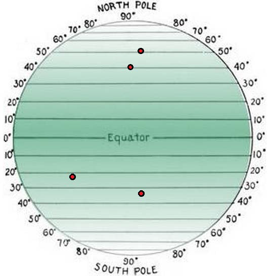
Look at the output of summary(world.data) again. Check the range of the variable latitude. It is less than 1. The codebook clarifies that the latitude of a country's capital has been divided by 90 to get a variable that ranges from zero to one. This is not nice. When interpreting the effect of such a variable a unit change (a change of 1) covers the entire range or put differently, it is a change from a country at the equator to a country at one of the poles. We therefore multiply by 90 again. This will turn the units of the latitude variable into degrees again which makes interpretation easier.
# transform latitude variable
world.data$latitude <- world.data$latitude * 90
Estimating a Bivariate Regression
Is there a correlation between the distance of a country to the equator and the level of political stability? Both political stability (dependent variable) and distance to the equator (independent variable) are continuous. Therefore, we will get an idea about the relationship using a scatter plot. Looking at the cloud of points suggests that there might be a positive relationship. Positive means, that increasing our independent variable latitude is related to an increase in the dependent variable pol.stability (the further from the equator, the more stable). We can fit a line of best fit through the points. To do this we must estimate the bivariate model with the lm() function and then plot the line using the abline() function.
# plot political instability against distance to equator
plot(x = world.data$latitude, y = world.data$pol.stability, # x and y variables
     frame = FALSE, # no frame around the plot
     pch = 20, # point type
     main = "Relation b/w  Distance to the Equator and Political Stability", # title
     xlab = "distance to equator in degrees", # x axis title
     ylab = "political stability" # y axis title
     )

# bivariate OLS model
m1 <- lm(pol.stability ~ latitude, data = world.data )

# plot line of best fit
abline(m1)
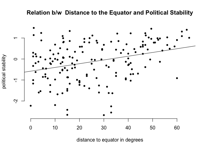
# regression output
screenreg(m1)
=======================
             Model 1
-----------------------
(Intercept)   -0.58 ***
              (0.12)
latitude       0.02 ***
              (0.00)
-----------------------
R^2            0.11
Adj. R^2       0.10
Num. obs.    170
RMSE           0.89
=======================
*** p < 0.001, ** p < 0.01, * p < 0.05
Regression Interpretation
To interpret regression output you need to interpret it in statistical terms and in substantial terms:
| Statistical | What to do | |
|---|---|---|
 |
Significance | Is estimate statistically significant? Can you reject the null hypothesis that there is no effect? Look at the p-values of the estimates of your independent variables. |
| Substantial | What to do | |
|---|---|---|
 |
Direction | Look at the sign of an effect. Is the effect positive or negative? Does a unit-change of your independent variable increase or decrase the dependent variable? |
 |
Strength | Illustrate how large the effect on the dependent variable is. |
You may also look at the model fit, especially when comparing multiple models. How much variance is explained.
Interpretation of the Intercept
The screenreg() function prints the regression table to the screen. Lets interpret it.
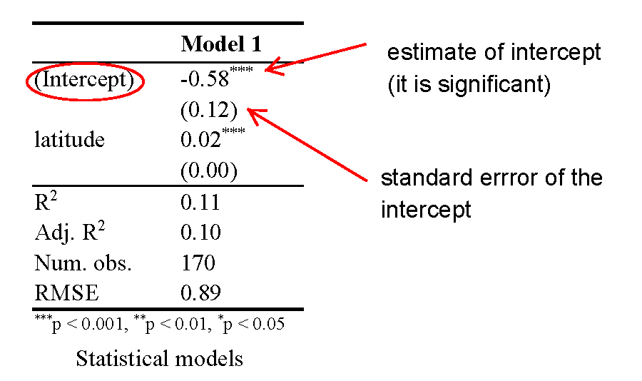
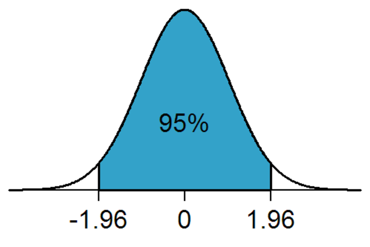
The intercept is meaningful in this case. The estimate of the intercept is -0.58. It is the level of political stability when latitude is 0. So, it is the level of stability for countries that are on the equator. Because the intercept is meaningful, you mak look at the significance level of the intercept. It is statistically significant. On a 95% confidence level, the political stability of a country at the equator is estimate + and - 1.96 * standard error of estimate, i.e. -.58 + and - 1.96 * 0.12. How much is -0.58 political stability? The dependent variable is an index, so it is hard to interpret substantially. One thing we can do is to check how many countries have smaller values. To do this we use the which() function. It returns whether an observation fulfills the condition in parenthesis, e.g. world.data$pol.stability is smaller than -0.58. In combination with the length() function we get the number of countries for which this is true.
Running the code below, we predict a value of political stability for countries at the equator that is not that low. 51 countries have smaller values out of 170.
# how many countries have political stability value lower than -0.58
length( which( world.data$pol.stability < -0.58) )
[1] 51
Interpretation of the Independent Variable
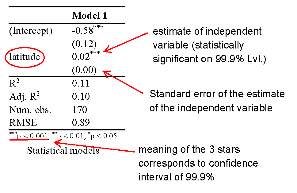
For all our independent variables (we only have 1 in this example), we check for statistical significance first. The effect is significantly different from zero. It is positive, so increasing the distance to the equator, corresponds to increasing values of political stability. Again, because our dependent variable is an index the absolute increase is hard to interpret. However, we can interpret the effect in terms of percentage point changes. The effect of an increase of 1 degree is 0.02 units of political stability. How much is that? To find out we estimate the range of the political stability variable like we learned in week 2.
# the distance between the minimum and maximum of the dependent variable
diff(range(world.data$pol.stability))
[1] 4.153852
It is nice that the effect of the independent variable is in units of the dependent variable. We can estimate changes in percentage point terms, like so:
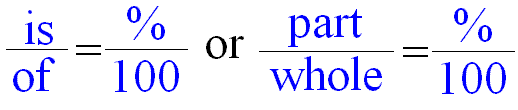
Knowing the range of our dependent variable, we now estimate the effect of a 10 degrees increase of distance to the equator in percentage terms. The estimate for a one degree increase is 0.02, so the effect of a 10 degrees increase is 0.2. That effect over (divided by) the entire range of political stability gives us the percentage point change in the dependent variable for a 10 degrees increase in distance to the equator. Running the code below, shows that an increase of 10 degrees of latitude corresponds to an increase of 5 percentage points of political stability.
# percentage change in the dependent variable
# of an increase in 10 degrees of the independent variable
0.2 / diff(range(world.data$pol.stability))
[1] 0.04814808
Dplyr: filter()
Remember that select() lets us choose certain columns, filter() lets us choose rows (observations). If you want to look at men only, then filter would let you do that. The first argument, that filter() takes is the name of the data set. The second argument is the expression or condition that specifies which rows to look at. We will look at the variable qual.inst. We could be interested in the 5% of countries with the lowest quality of institutions. The expression below gives us the countries that have a value of political stability that is at the 5th percentile or below.
# countries with lowest 5 percent of quality of institutions
filter(world.data, qual.inst <= quantile(qual.inst, 0.05))
             country pol.stability  latitude globalization qual.inst
1        Afghanistan    -2.5498192 33.000003      31.46042       1.4
2             Angola    -0.2163249 12.300003      44.73296       1.9
3            Myanmar    -1.2828478 21.999996      31.98166       1.4
4            Burundi    -1.5960978  3.300003      33.49548       1.8
5               Chad    -1.5122881 15.000003      40.14969       1.7
6  Equatorial Guinea     0.2329705  1.999998      26.25858       1.9
7               Iraq    -2.2555389 33.000003      40.10164       1.5
8      Sudan (-2011)    -2.6600206 15.000003      36.19482       1.6
9       Turkmenistan     0.2565168 39.999995      36.06469       1.6
10        Uzbekistan    -0.7269843 41.000003      34.40682       1.6
We could also look at the BRIC countries only. The %in% operator lets you specify that country should equal Brazil, Russia, India or China.
# which values do the BRIC countries have
filter(world.data, country %in% c("Brazil", "Russia", "India", "China"))
  country pol.stability  latitude globalization qual.inst
1  Brazil     0.0057122  9.999999      59.20744       3.7
2   China    -0.6571777 35.000001      59.42661       3.5
3   India    -1.2331525 19.999997      51.57328       3.3
4  Russia    -0.9127547 60.000002      67.77659       2.1
Multivariate Regression
Distance to the equator is not be the best predictor for political stability. This is because there is no causal link between the two. We should think of other variables to include in our model. We will include the index of globalization (higher values mean more integration with the rest of the world) and the quality of institutions. For both we can come up with a causal story for their effect on political stability. Including the two new predictors leads to substantial changes. First, we now explain 49% of the variance of our dependent variable instead of just 11%. Second, the effect of the distance to the equator is no longer significant. Better quality institutions correspond to more political stability. Quality of institutions ranges from 1 to 10. You can estimae the effect of increasing the quality of institutions by 10 percentage points (e.g. from 4 to 5) by dividing 0.34 (the estimate of qual.inst) by the range of the dependent variable. This will give you the change in percentage points of the dependent variable for a 10 percentage points change of qual.inst.
# model with more explanatory variables
m2 <- lm(pol.stability ~ latitude + globalization + qual.inst, data = world.data)

# print model output to screen
screenreg( list(m1, m2))
=====================================
               Model 1     Model 2
-------------------------------------
(Intercept)     -0.58 ***   -1.25 ***
                (0.12)      (0.20)
latitude         0.02 ***    0.00
                (0.00)      (0.00)
globalization               -0.00
                            (0.01)
qual.inst                    0.34 ***
                            (0.04)
-------------------------------------
R^2              0.11        0.50
Adj. R^2         0.10        0.49
Num. obs.      170         170
RMSE             0.89        0.67
=====================================
*** p < 0.001, ** p < 0.01, * p < 0.05
Joint Significance Test (F-statistic)
Whenever you add variables to your model, you will explain more variance in the dependent variable. That means, using your data, your model will better predict outcomes. We would like to know whether the difference (the added explanatory power) is statistically significant. The null hypothesis is that the added explanatory power is zero and the p-value gives us the probability of observing such a difference as the one we actually computed assuming that null hypothesis (no difference) is true.
The F-test is a joint hypothesis test that lets us compute that p-value. Two conditions must be fulfilled to run an F-test:
| Conditions for F-test model comparison | |
|---|---|
 |
Both models must be estimated from the same sample! If your added variables contain lots of missing values and therefore your n (number of observations) are reduced substantially, you are not estimating from the same sample. |
|
The models must be nested. That means, the model with more variables must contain all of the variables that are also in the model with fewer variables. |
We specify two models: a restricted model and an unrestricted model. The restricted model is the one with fewer variables. The unrestricted model is the one including the extra variables. We say restricted model because we are "restricting" it to NOT depend on the extra variables. Once we estimated those two models we compare the residual sum of squares (RSS). The RSS is the sum over the squared deviations from the regression line and that is the unexplained error. The restricted model (fewer variables) is always expected to have a larger RSS than the unrestricted model. Notice that this is same as saying: the restricted model (fewer variables) has less explanatory power. We test whether the reduction in the RSS is statistically significant using a distribution called "F distribution". If it is, the added variables are jointly (but not necessarily individually) significant. In R you type anova(restriced model, unrestriced model), to get the following output:
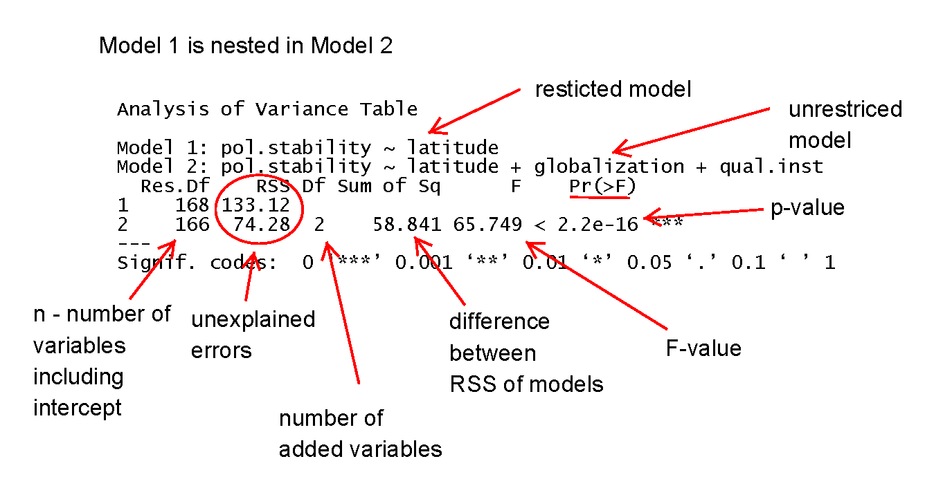
# joint significance (F-statistic)
anova(m1, m2)
Analysis of Variance Table

Model 1: pol.stability ~ latitude
Model 2: pol.stability ~ latitude + globalization + qual.inst
  Res.Df    RSS Df Sum of Sq      F    Pr(>F)
1    168 133.12
2    166  74.28  2    58.841 65.749 < 2.2e-16 ***
---
Signif. codes:  0 '***' 0.001 '**' 0.01 '*' 0.05 '.' 0.1 ' ' 1
Predicting Outcome conditional on institutional quality
To predict and to show our uncertainty, we use zelig() again. We run the same regression as we did in model 2. Therefore, our regression output of z.out (which is just a name, you could have called it model 3) will be the same as model 2. The advantage of zelig() is what comes next. Predicting outcomes and presenting the uncertainty attached to our predictions.
We proceed in four steps.
- We estimate the model.
We set the covariates.
- you do not have to set all covariates. E.g.: we are only setting values for the quality of institutions but not for
latitudeorglobalization. Depending on the level of measurement, zelig will automatically set covariate values for the variables where you did not specify values yourself. Continuous variables will be set to their means, ordinal ones to the median, and categorical ones to the mode.
- you do not have to set all covariates. E.g.: we are only setting values for the quality of institutions but not for
We simulate.
- We plot the results.
# multivariate regression model
z.out <- zelig( pol.stability ~ latitude + globalization + qual.inst,
                model = "ls", data = world.data, cite = FALSE)

# setting covariates
x.out <- setx(z.out, qual.inst = seq(0, 10, 1))

# simulation
s.out <- sim(z.out, x = x.out)

# plot results
plot(s.out, qi = "pv", xlab = "Quality of Institutions")
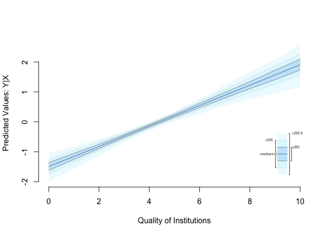
Sometimes, you want to compare two groups. We could be interested in comparing countries with low institutional quality to countries with high institutional quality with respect to the effect on political stability. You can easily do this, using zelig(). We construct a hypothetical case. Specifically, what happens if you move from the 25th percentile of institutional quality to the 75th percentile of institutional quality?
# 25th percentile of quality of institutions
x.out.low <- setx(z.out, qual.inst = quantile(world.data$qual.inst, 0.25))

# 75th percentile of quality of institutions
x.out.high <- setx(z.out, qual.inst = quantile(world.data$qual.inst, 0.75))

# simulation
s.out <- sim(z.out, x = x.out.low, x1 = x.out.high)

# summary output
summary(s.out)
Model:  ls
Number of simulations:  1000

Values of X
  (Intercept) latitude globalization qual.inst
1           1 25.78218      57.93053       2.5
attr(,"assign")
[1] 0 1 2 3

Values of X1
  (Intercept) latitude globalization qual.inst
1           1 25.78218      57.93053     5.175
attr(,"assign")
[1] 0 1 2 3

Expected Values: E(Y|X)
    mean    sd   50% 2.5%  97.5%
1 -0.652 0.077 -0.65 -0.8 -0.499

Expected Values: E(Y|X1)
   mean    sd   50%  2.5% 97.5%
1 0.261 0.065 0.261 0.136  0.39

Predicted Values: Y|X
    mean    sd   50% 2.5%  97.5%
1 -0.652 0.077 -0.65 -0.8 -0.499

Predicted Values: Y|X1
   mean    sd   50%  2.5% 97.5%
1 0.261 0.065 0.261 0.136  0.39

First Differences: E(Y|X1) - E(Y|X)
   mean    sd   50%  2.5% 97.5%
1 0.913 0.098 0.915 0.721 1.099
# plot results
plot(s.out)
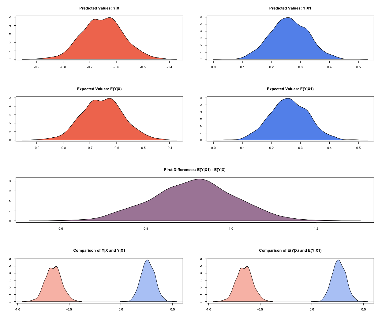
We are in the linear world. When we summarise results from simulations done by zelig() it always shows predicted and expected values. They are the same in the linear world. You can verify this by comparing the numbers but also by looking at the plot. Lets get to the interpretation of our results using both plot and the numbers from the summary. We will only talk about predicted values but talking about expected values would be just the same. In the sim() function we specified that X is the low quality of institutions case and X1 is the high quality of institutions case. Our dependent variable is political stability. We predict a mean level of political stability of -0.652 for the low quality of institutions case. You get this number from the output of summary(s.out) looking at the line Predicted Values: Y|X which you read as Y given X. Similarly, we predict a mean level of political stability for the high institutional quality case of 0.261 (look at the line Predicted Values: Y|X1). You can see this in the first two rows of the plot es well. When you want to know whether the difference between the two groups (low quality institutions & high quality institutions) is significantly different from zero (statistically significant) you look at the first difference. The mean first difference is 0.913. Looking at the 95% confidence level the difference is between 0.721 and 1.099. This interval does not include zero, you can reject the null hypothesis that the difference is zero. You can also see this visually in the plot. The third row first differences plot does not overlap the value 0 on the x-axis.
Exercises
Before you get started with the exercises, load the libraries Zelig and texreg.
- Clear your workspace and set your working directory to "N:/PUBLG100" if you work on a UCL computer or to your preferred directory if you work on your own computer.
- Load the data set corruption.csv located at
http://uclspp.github.io/PUBLG100/data/corruption.csv. Hint: theread.csv()function is needed for this. - Inspect the data. Spending some time here will help you for the next tasks. Knowing and understanding your data will help you when running and interpreting models and you are less prone to making mistakes.
Run a regression on
gdp. Useti.cpi(corruption perceptions index, larger values mean less corruption) andregionas independent variables. Print the model results to a word file called model1.doc. Also, print your output to the screen.- Spoiler (this will make sense when looking at the regression output): Region is a categorical variable and R recognizes it as a factor variable. The variable has four categories corresponding to the four regions. When you run the model, the regions are included as binary variables (also sometimes called dummies) that take the values 0 or 1. For example,
regionAmericasis 1 when the observation (the country) is from the Americas. Only three regions are included in the model, while the fourth is what we call the baseline or reference category. It is included in the intercept. Interpreting the intercept would mean, looking at a hypothetical African country whereti.cpiis zero. If the estimate for the region dummy Europe is significant then that means that there is a difference in the dependent variable between European countries and the baseline category Africa.
- Spoiler (this will make sense when looking at the regression output): Region is a categorical variable and R recognizes it as a factor variable. The variable has four categories corresponding to the four regions. When you run the model, the regions are included as binary variables (also sometimes called dummies) that take the values 0 or 1. For example,
Does the inclusion of region improve model fit compared to a model without regions but with the corruption perceptions index? Hint: You need to compare two models.
- Predict
gdpby varyingti_cpifrom lowest to highest using the model that includesregion. Plot your results. - Is there a difference between Europe and the Americas? Hint: is the difference between the predicted values for the two groups significantly different from zero?