- Introduction
- 1. Introduction to Quantitative Analysis
- 2. Descriptive Statistics
- 3. T-test for Difference in Means and Hypothesis Testing
- 4. Bivariate linear regression models
- 5. Multiple linear regression models
- 6. Assumptions and Violations of Assumptions
- 7. Interactions
- 8. Panel Data, Time-Series Cross-Section Models
- 9. Binary models: Logit
- 10. Frequently Asked Questions
- 11. Optional Material
- 12. Datasets
- 13. R Resources
- 14. References
- Published with GitBook
2. Descriptive Statistics
2.1 Seminar
Setting a Working Directory
Before you begin, make sure to set your working directory to a folder where your course related files such as R scripts and datasets are kept. We recommend that you create a PUBLG100 folder for all your work. Create this folder on N: drive if you're using a UCL computer or somewhere on your local disk if you're using a personal laptop.
Once the folder is created, use the setwd() function in R to set your working directory.
| Recommended Folder Location | R Function | |
|---|---|---|
| UCL Computers | N: Drive | setwd("N:/PUBLG100") |
| Personal Laptop (Windows) | C: Drive | setwd("C:/PUBLG100") |
| Personal Laptop (Mac) | Home Folder | setwd("~/PUBLG100") |
After you've set the working directory, verify it by calling the getwd() function.
getwd()
Now download the R script for this seminar from the "Download .R Script" button above, and save it to your PUBLG100 folder.
# clear environment
rm(list = ls())
Packages
 What are packages and why should I care?
Packages are bundled pieces of software that extend the functionality of R far beyond what's available when you install R for the first time. Just as smartphone "apps" add new features or make existing features easier to use, packages add new functionality or provide convenient functions for tasks that otherwise would be cumbersome to do using base R packages. Some R packages are designed to carry out very specific tasks while others are aimed at offering a general purpose set of functions. We will get a chance to work with both specific and generic type of packages over the next several weeks.
A small number of core packages come pre-installed with R but thousands of extremely useful packages are available for download with just a few keystrokes within R. The strength of R comes not just from the language itself but from the vast array of packages that you can download at no cost.
Let's take a look at the similarities between apps on mobile devices and packages for R and then we will cover how to install and use packages in the sections that follow.
| Mobile Apps | R Packages | |
|---|---|---|
| Pre-installed |    |
base, foreign, graphics, stats . . . Complete List |
| Most Popular |    |
ggplot2, stringr, dplyr . . . |
| How to Install | • From the App Store • May require occasional updates |
• Using install.packages() • May require occasional updates |
| Compatibility | Often dependent on specific version of iOS or Android | Often dependent on specific version of R |
| How to Use |  |
Using library() to load the package |
| How many are available | Millions | More than 6000 |
Installing Packages
Recall from last week that we used the read.csv() function to read a file in Comma Separated Values (CSV) format. While CSV is an extremely popular format, the dataset we're using in this seminar is only available in Microsoft Excel format. In order to load this dataset we need a package called readxl.
We will install the readxl package with the install.packages() function. The install.packages() function downloads the package from a central repository so make sure you've internet access before attempting to install it.
install.packages("readxl")
Installing package into '/Users/altaf/Library/R/3.2/library'
(as 'lib' is unspecified)


The downloaded binary packages are in
    /var/folders/62/x92vvd_n08qb3vw5wb_706h80000gp/T//RtmpsqPUmW/downloaded_packages
 Watch out for errors and warning messages when installing or loading packages.
Removing Packages
On rare occasions, you might have to remove a package from R. Although we will not demonstrate removing packages in this seminar, it is worth noting that the remove.packages() function can be used to remove a package if necessary.
Using Packages
Once a package is installed, it must be loaded in R using the library() function. Let's load the readxl package so we can use the functions it provides for reading a file an Excel file. The library() function takes the name of the package as an argument and makes the functionality from that package available to us in R.
library(readxl)
Now that the readxl package is loaded, we can load our dataset. In this seminar, we're using a small subset of High School and Beyond survey conducted by the National Center of Education Statistics in the U.S. Our dataset includes observations from 200 students with variables including each student's race, gender, socioeconomic status, school type, and scores in reading, writing, math, science and social studies.
First, we need to download the dataset and save it to our PUBLG100 folder. If you haven't set your working directory yet, make sure to follow the Getting Started instructions from the top of this page.
Download 'High School and Beyond' Dataset
Next we load the dataset using the read_excel() function from the readxl package.
# make sure you've downloaded the dataset from http://uclspp.github.io/PUBLG100/data/hsb2.xlsx
# to your PUBLG100 working directory.

student_data <- read_excel("hsb2.xlsx")
Let's familiarize ourselves with the data by examining what the variables are and quickly glance at the data. We can look at the variable names with the names() function.
names(student_data)
 [1] "id"      "female"  "race"    "ses"     "schtyp"  "prog"    "read"
 [8] "write"   "math"    "science" "socst"
The dim() function can be used to find out the dimensions of the dataset.
dim(student_data)
[1] 200 11
The dim() function tells us that we have data from 200 students with 11 variables for each student.
Let's take a quick peek at the first 10 observations to see what the dataset looks like. By default the head() function returns the first 6 rows, but let's tell it to return the first 10 rows instead.
head(student_data, n = 10)
    id female race ses schtyp prog read write math science socst
1   70      0    4   1      1    1   57    52   41      47    57
2  121      1    4   2      1    3   68    59   53      63    61
3   86      0    4   3      1    1   44    33   54      58    31
4  141      0    4   3      1    3   63    44   47      53    56
5  172      0    4   2      1    2   47    52   57      53    61
6  113      0    4   2      1    2   44    52   51      63    61
7   50      0    3   2      1    1   50    59   42      53    61
8   11      0    1   2      1    2   34    46   45      39    36
9   84      0    4   2      1    1   63    57   54      58    51
10  48      0    3   2      1    2   57    55   52      50    51
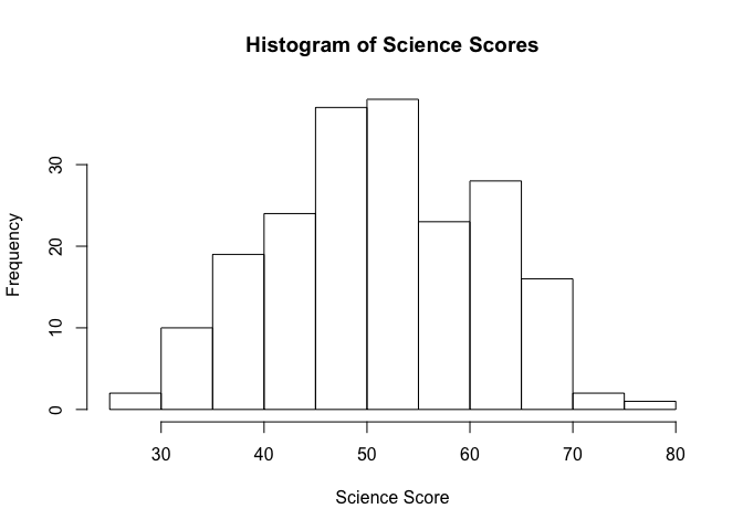
We can visualize the data with the help of a histogram, so let's see how the science scores in our dataset are distributed.
hist(student_data$science, main = "Histogram of Science Scores", xlab = "Science Score")
 Notice how the
 $ (dollar sign) is used to access the science variable from student_data. We briefly saw this syntax in last week's exercise when we loaded the Polity IV dataset, but let's dig a little deeper and see how it works. Datasets loaded with read.csv() or read_excel() return what is called a data frame in R. We can think of a data frame as a table of rows and columns and similar to what most of us have seen as spreadsheets in programs like Microsoft Excel. Data frames can be created manually with the data.frame() function but are usually created by functions like read.csv() or read_excel() that load datasets from a file or from a web URL.
In the High School and Beyond dataset, every column has a name and can be accessed using this $ (dollar sign) syntax. For example, reading scores can be accessed with student_data$read, writing scores can be accessed with student_data$write and so on.
Central Tendency
Arithmetic mean
The arithmetic mean (or average) is the most widely used measure of central tendency. We all know how to calculate the mean by dividing the sum of all observations by the number of observations. In R, we can get the sum with the sum() function, and the number of observations with the length() function.
So if we were interested in calculating the mean science score from the High School and Beyond dataset, we could do the following:
sum(student_data$science) / length(student_data$science)
[1] 51.865
While calculating the mean is relatively simple to do manually, R provides us with an even easier way to do the same with a function called mean().
science_mean <- mean(student_data$science)
science_mean
[1] 51.865
Median
R also provides a median() function for finding the median science score.
science_median <- median(student_data$science)
science_median
[1] 53
Mode
There is no built-in function in R that returns the mode from a dataset. There are numerous packages that provide a mode function, but it's quite simple to do it ourselves and it's a good exercise for exploring some of R's data manipulation functions.
We start by tabulating the data first and since our dataset is quite small, we can easily spot the mode with visual inspection.
science_scores <- table(student_data$science)
science_scores
26 29 31 33 34 35 36 39 40 42 44 45 46 47 48 49 50 51 53 54 55 56 57 58 59
 1  1  2  2  5  1  4 13  2 12 11  1  1 11  2  2 21  2 15  3 18  2  1 19  1
61 63 64 65 66 67 69 72 77
14 12  1  1  9  1  6  2  1
The table() function tells us the science scores that students received and the frequency of each score. For example, the score 26 occurs 1 times, the score 29 occurs 1 times, the score 31 occurs 2 times and so on. The mode in this case is 50 which occurs 21 times.
But we'd really like to find the mode programmatically instead of manually scanning a long list of numbers. So let's sort science_scores from largest to the smallest so we can pick out the mode. The sort() function allows us to do that with the decreasing = TRUE option.
sorted_science_scores <- sort(science_scores, decreasing = TRUE)
sorted_science_scores
50 58 55 53 61 39 42 63 44 47 66 69 34 36 54 31 33 40 48 49 51 56 72 26 29
21 19 18 15 14 13 12 12 11 11  9  6  5  4  3  2  2  2  2  2  2  2  2  1  1
35 45 46 57 59 64 65 67 77
 1  1  1  1  1  1  1  1  1
Because we sorted our list from largest to the smallest, the mode is the first element in the list.
science_mode <- sorted_science_scores[1]
science_mode
50
21
Now let's suppose we wanted to find out the highest score in science and also wanted to see the ID of the student who received the highest score.
The max() function tells us the highest score, and which.max() tells us the row number of the student who received it.
max(student_data$science)
[1] 77
which.max(student_data$science)
[1] 74
Recall from last week's seminar the various different ways of indexing a vector or a matrix using the square brackets. Indexing of data frames works the same way. To get the ID of the student all we need to do is index the student_data with the row number we are interested in.
top_science_student <- which.max(student_data$science)
top_science_student_id <- student_data[top_science_student,]$id
top_science_student_id
[1] 157
Now we know that the student with ID 157 has the highest science score of 77.
Dispersion
While measures of central tendency represent the typical values for a dataset, we're often interested in knowing how spread apart the values in the dataset are. The range is the simplest measure of dispersion as it tells us the difference between the highest and lowest values in a dataset. Let's continue with science scores example and find out the range of our dataset using the range() and diff() functions.
science_range <- range(student_data$science)
diff(science_range)
[1] 51
Using a combination of range() and diff() functions we see that the difference between the two extremes (i.e. the highest and the lowest scores) in our dataset is 51.
Variance
Although the range gives us the difference between the two end points of the datasets, it still doesn't quite give us a clear picture of the spread of the data. What we are really interested in is a measure that takes into account how far apart each student's score is from the mean. This is where the concept of variance comes in.
We can calculate the variance in R with the var() function.
var(student_data$science)
[1] 98.74048
Standard Deviation
The standard deviation is simply the square root of the variance we calculated in the last section. We could manually take the square root of the variance to find the standard deviation, but R provides a convenient sd() function that we will use instead.
sd(student_data$science)
[1] 9.936824
Percentiles and Quantiles
The median value of a dataset is also known as the 50th percentile. It simply means that 50% of values are below the median and 50% are above it. In addition to the median, the 25th percentile (also known as the lower quartile) and 75th percentile (or the upper quartile) are commonly used to describe the distribution of values in a number of fields including standardized test scores, income and wealth statistics and healthcare measurements such as a baby's birth weight or a child's height compared to their respective peer group.
We can calculate percentiles using the quantile() function in R. For example, if we wanted to see the science scores in the 25th, 50th and 75th percentiles, we would call the quantile() function with c(0.25, 0.5, 0.75) as the second argument.
quantile(student_data$science, c(0.25, 0.5, 0.75))
25% 50% 75%
 44  53  58
The quantile() function tells us that 25% of the students scored 44 or below, 50% scored 53 or below and 75% scored 58 or below in science.
Factor Variables
Recall from last week's lecture that categorical (or nominal) variables are variables that take a fixed number of distinct values with no ordering. Some common examples of categorical variables are colors (red, blue, green), occupation (doctor, lawyer, teacher), and countries (UK, France, Germany). In R, when categorical variables are stored as numeric data (e.g. 1 for male, 2 for female), we must convert them to factor variables to ensure that categorical data are handled correctly in functions that implement statistical models, tables and graphs. Datasets from public sources such the U.N, World Bank, etc often encode categorical variables with numerical values so it is important to convert them to factor variable before running any data analysis.
The High School and Beyond dataset that we've been using is one such example where categorical variable such as race, gender and socioeconomic status are coded as numeric data and must be converted to factor variables.
We'll use the following code book to create categorical variables for gender, race, and socioeconomic status.
| Categorical Variable | New Factor Variable | Levels |
|---|---|---|
| female | gender | 0 - Male 1 - Female |
| ses | socioeconomic_status | 1 - Low 2 - Middle 3 - High |
| race | racial_group | 1 - Black 2- Asian 3 - Hispanic 4 - White |
We can convert categorical variables to factor variables using the factor() function. The factor() function needs the categorical variable and the distinct labels for each category (such as "Male", "Female") as the two arguments for creating factor variables.
student_data$gender <- factor(student_data$female, labels = c("Male", "Female"))
student_data$socioeconomic_status <- factor(student_data$ses, labels = c("Low", "Middle", "High"))
student_data$racial_group <- factor(student_data$race, labels = c("Black", "Asian", "Hispanic", "White"))
Let's quickly verify that the factor variables were created correctly.
head(student_data)
   id female race ses schtyp prog read write math science socst gender
1  70      0    4   1      1    1   57    52   41      47    57   Male
2 121      1    4   2      1    3   68    59   53      63    61 Female
3  86      0    4   3      1    1   44    33   54      58    31   Male
4 141      0    4   3      1    3   63    44   47      53    56   Male
5 172      0    4   2      1    2   47    52   57      53    61   Male
6 113      0    4   2      1    2   44    52   51      63    61   Male
  socioeconomic_status racial_group
1                  Low        White
2               Middle        White
3                 High        White
4                 High        White
5               Middle        White
6               Middle        White
Now that we've created factor variables for our categorical data, we can run crosstabs on these newly created factor variables and see how our sample is distributed among different groups. We know that our dataset has 200 observations, but let's see how many are male students and how many are female students.
table(student_data$gender)
  Male Female
    91    109
Next, let's see how the different socioeconomic groups (Low, Middle, High) are represented in our dataset.
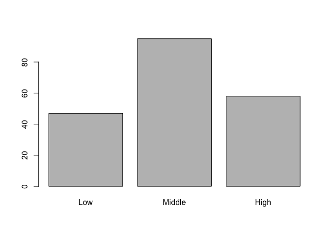
table(student_data$socioeconomic_status)
   Low Middle   High
    47     95     58
Finally, we can run two-way crosstabs to see how the different racial groups are distributed over the three socioeconomic levels.
table(student_data$socioeconomic_status, student_data$racial_group)
         Black Asian Hispanic White
  Low        9     3       11    24
  Middle    11     5        6    73
  High       4     3        3    48
The crosstabs tell us that of 121 of 145 white students are from a middle or high socioeconomic group. In contrast only 15 of the total 24 black students are from the middle or high socioeconomic groups.
Factor variables can also be used to split our dataset based on the distinct factors or categories. Let's suppose we wanted to see the difference between science scores for boys and girls. One way to accomplish that would be by using the subset() function to split the dataset into boys and girls and then comparing the mean science scores for each group.
boys <- subset(student_data, gender == "Male")
girls <- subset(student_data, gender == "Female")
mean(boys$science)
[1] 53.26374
mean(girls$science)
[1] 50.69725
According to our dataset, the mean science score for boys is 53.2637363, compared to the mean science score of 50.6972477 for the girls.
Visualizing Data
Let's move on to some visualizations starting with a bar chart of socioeconomic status and let's take advantage of the factor variable we created above. Since socioeconomic_status is a factor variable, R automatically knows how to draw bars for each factor and label them accordingly.
# bar charts
barplot(table(student_data$socioeconomic_status))
In addition to being able to correctly group and label a bar chart with distinct categories, factor variables can also be used to create box plots automatically with the plot() function. The plot() function understands that we are interested in a box plot when we pass it a factor variable for the x-axis.
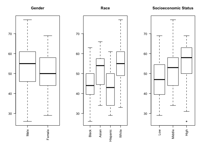
We can make our chart even more informative by comparing the science score based on gender, race and socioeconomic status in a single figure with side-by-side sub-plots for each variable. In order to accomplish that, we use the par() function to change graphical parameters and instruct R to create a figure with 1 row and 3 columns using the mfrow=c(1,3) option. Once the graphical parameters are set, the three plots for gender, race and socioeconomic status variables will be created side-by-side in a single figure.
We would like to rotate the x-axis labels 90 degrees so that they are perpendicular to the axis. Most graphics functions in R support a label style las option for rotating axis labels. The las option can take these 4 values:
| Value | Axis Labels |
|---|---|
| 0 | Always parallel to the axis [default] |
| 1 | Always horizontal |
| 2 | Always perpendicular to the axis |
| 3 | Always vertical |
To rorate the axis labels 90 degrees, we'll use las = 2 when calling the plot() function.
# science score by gender, race and socioeconomic status
par(mfrow=c(1,3))

# categorical variables are plotted as boxplots
plot(student_data$gender, student_data$science, main = "Gender", las = 2)
plot(student_data$racial_group, student_data$science, main = "Race", las = 2)
plot(student_data$socioeconomic_status, student_data$science, main = "Socioeconomic Status", las = 2)
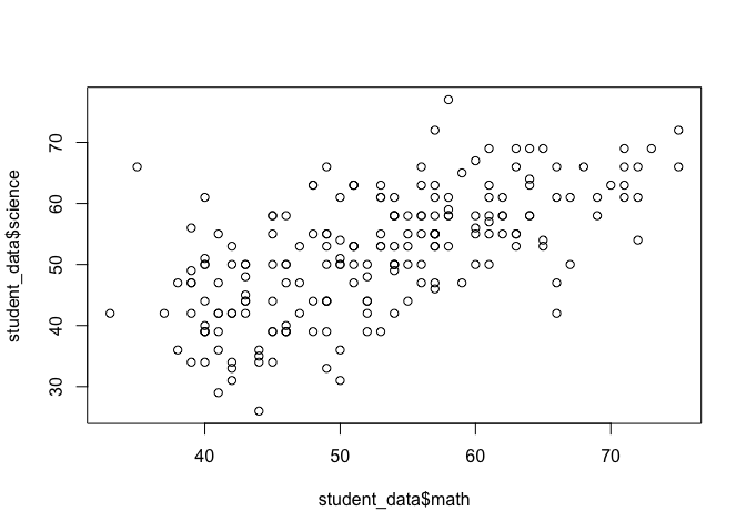
Now let's see if we can visually examine the relationship between science and math scores using a scatter plot. Before we call the plot() function we need to reset the graphical parameters to make sure that our figure only contains a single plot by calling the par() function and using the mfrow=c(1,1) option.
par(mfrow=c(1,1))
plot(student_data$math, student_data$science)
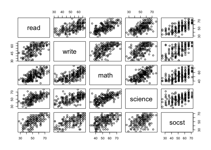
What if we were interested in plotting the relationship between other subjects as well? Although we can always repeat the same plot() function above and keep replacing the subject names, there's an easier way to generate a matrix of scatter plots with pairwise relationships. We can use the pairs() function and pass it a formula that includes all the variables that we want to include in the pairwise matrix.
pairs(~ read + write + math + science + socst, data = student_data)
The apply() Function
Suppose we wanted to create a new variable called english which represented the average of each student's reading and writing scores. We could call the mean() function manually for each student and update the english variable but that would be inefficient and extremely time consuming. Fortunately, R provide us built-in support for tasks like this with the apply() function. The appropriately named apply() function allows us to 'apply' any function to either the rows or the columns of a matrix or a data frame in a single call.
Here is a list of arguments the apply() function expects and their descriptions:
apply(x, margin, function)
| Argument | Description |
|---|---|
x |
The first argument is the dataset that we want the apply function to operate on. Since we're averaging over reading and writing scores, we select only the read and write columns. |
margin |
The second argument tells apply() to either apply the function row-by-row (1) or column-by-column (2). We need to apply the mean function to each row by specifying the second argument as 1. |
function |
The third argument is simply the function to be applied to each row, or mean in our case. |
Let's take a look at apply() in action:
student_data$english <- apply(student_data[c("read", "write")], 1, mean)
Let's use head() to inspect our dataset with the english scores.
head(student_data)
   id female race ses schtyp prog read write math science socst gender
1  70      0    4   1      1    1   57    52   41      47    57   Male
2 121      1    4   2      1    3   68    59   53      63    61 Female
3  86      0    4   3      1    1   44    33   54      58    31   Male
4 141      0    4   3      1    3   63    44   47      53    56   Male
5 172      0    4   2      1    2   47    52   57      53    61   Male
6 113      0    4   2      1    2   44    52   51      63    61   Male
  socioeconomic_status racial_group english
1                  Low        White    54.5
2               Middle        White    63.5
3                 High        White    38.5
4                 High        White    53.5
5               Middle        White    49.5
6               Middle        White    48.0
Distributions in R
One of the default packages in R called stats provides a number of functions for drawing random samples from a distribution.
 The
The rnorm() function, for example, can be used to draw from a normal distribution.
normal_dist <- rnorm(10, mean = 0, sd = 1)
normal_dist
 [1]  0.5190621 -0.6490014  0.6000356  0.8229315 -0.2367662  0.3455016
 [7] -0.7275797  1.0323298  0.3468205 -1.2818195
 The
The runif() function can be used to draw from a uniform distribution. For example, we can simulate rolling a 6-sided die with the following code.
num_rolls <- 10 # number of times to roll the dice
rolls <- as.integer(runif(num_rolls, min = 1, max = 7))
rolls
[1] 2 1 2 1 3 3 2 1 3 3
Click here for a list of distributions supported in the stats package.
Additional Resources
Central Limit Theorem Illustration in R
There is also an online simulation of Central Limit Theorem where you can create any custom distribution and draw samples from it to see Central Limit Theorem in action.
Exercises
- Create a new file called "assignment2.R" in your
PUBLG100folder and write all the solutions in it. - Clear the workspace and set the working directory to your
PUBLG100folder. - Load the High School and Beyond dataset. Remember to load any necessary packages.
- Calculate the final score for each student by averaging the
read,write,math,science, andsocstscores and save it in a column calledfinal_score. - Calculate the mean, median and mode for the
final_score. Create a factor variable called
school_typefromschtypusing the following codes:- 1 = Public schools
- 2 = Private schools
How many students are from private schools and how many are from public schools?
- Calculate the variance and standard deviation for
final_scorefrom each school type. - Find out the ID of the students with the highest and lowest
final_scorefrom each school type. - Find out the 20th, 40th, 60th and 80th percentiles of
final_score. - Create box plot for
final_scoregrouped by theschool_typefactor variable to show the difference betweenfinal_scoreat public schools vs. private schools.