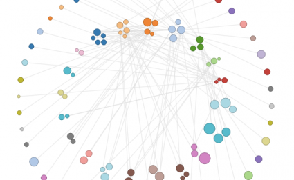
Interactive network visualizations make it easy to rearrange, filter, and explore your connected data. Learn how to make one using D3 and JavaScript.

Networks! They are all around us. The universe is filled with systems and structures that can be organized as networks. Recently, we have seen them used to convict criminals, visualize friendships, and even todescribe cereal ingredient combinations. We can understand their power to describe our complex world fromManuel Lima’s wonderful talk on organized complexity. Now let’s learn how to create our own.
In this tutorial, we will focus on creating an interactive network visualization that will allow us to get details about the nodes in the network, rearrange the network into different layouts, and sort, filter, and search through our data.
In this example, each node is a song. The nodes are sized based on popularity, and colored by artist. Links indicate two songs are similar to one another.
Try out the visualization on different songs to see how the different layouts and filters look with the different graphs.
http://flowingdata.com/2012/08/02/how-to-make-an-interactive-network-visualization/