 Close
Close

The UCL visual identity provides a consistent and coherent design language for UCL. As the most prominent visual representation of our university, we need to ensure it is used correctly.
UCL banner
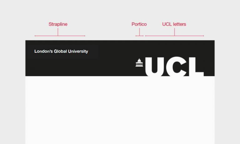
The most important visual element of the UCL brand is the banner. UCL’s visual identity is unusual because we do not use a traditional logo. The banner must appear, unaltered and fully legible, on all UCL communications.
The portico emblem is positioned to the left of the U and is a nod to UCL’s iconic Wilkins Building and UCL’s previous logos and stamps.
A strapline is always placed in the upper left-hand corner of the banner. The default strapline is: London's Global University. However, this can change to be a faculty or department. Two tiers of information are allowed, over a maximum of three lines.
UCL logo
When UCL is working in partnership with other organisations, or when it's impossible to use the banner, we use the logo.
UCL colours
We have a new, streamlined colour palette incorporating eight core colours, replacing the old 25-colour palette.

Typeface - Arial
Arial should be used for all external and internal creative assets. As a classic and commonly used sans-serif typeface, it is easy to read at both large and small point sizes. Helvetica can also be used as an alternative to Arial where available.
Using just one typeface can be elegant, modern, vibrant, or understated… it just depends on how you use it.
We also use Garamond as a secondary typeface. This should only be used in the body of the text, in complex documents which need an extra typeface for text hierarchy.
