Find out more about how we use UCL's primary typeface, Arial (or Helvetica), and our secondary typeface, Garamond.
Arial is UCL's primary typeface.
This is because it is available on all computers and systems at UCL.
Arial should be used for all external and internal creative assets. As a classic and commonly used sans-serif typeface, it is easy to read at both large and small point sizes.
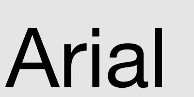
Typeface and communication
Type is an integral element in successful communication. It just depends on how you use it.
Using just one typeface can be elegant or modern, vibrant or understated.
Recommended use
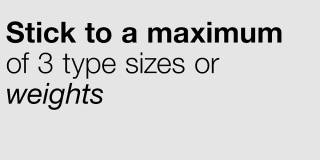
Stick to a maximum of three type sizes or weights.
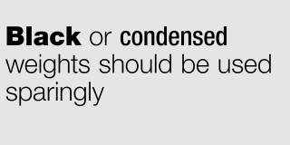
Black or condensed weights should be used sparingly.

Leave some clear space.
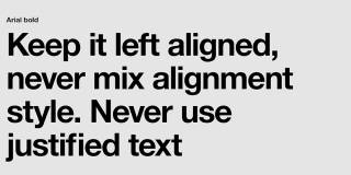
Keep it left aligned, never mix alignment style. Never use justified text.
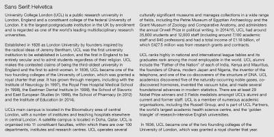
Helvetica as an alternative
Helvetica can also be used as an alternative to Arial where available.
Garamond as secondary
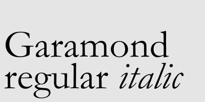
We also use Garamond as a secondary typeface.
This should only be used in the body of the text, in complex documents which need an extra typeface for text hierarchy.
Garamond should never be used in the banner.
 Close
Close

