XClose

Creative Services

Home
Menu

Designing Your Poster

How to design your academic poster for large format printing. Creative Services from UCL Educational Media.

Rolled-Up Large Printed Poster

Academic posters are used for a variety of purposes:

  • To advertise your department, university, research group or yourself
  • To help start a conversation and raise an interest in your work
  • To inform of an issue or persuade
  • To make new contacts for collaboration and jobs

A poster is a visual method of presentation and requires a different approach to writing a report or giving a presentation. It allows you to discuss your research and get feedback.


Things to consider before designing your poster

1. Objective

To grab attention and inspire interest. It is important to make it look interesting (if you want it to be read). There should be a strong central message with your research displayed concisely using well laid out clear text and colourful graphics to attract attention. 

2. Audience

  • Specialist 

  • Students 

  • General public 

  • How much existing knowledge does your audience have of your research project, methods and terminology? Design your poster accordingly. 

3. Content

  • Be selective, this must relate and be relevant to your audience so you get across all the information quickly and clearly. 

4. Set requirements  

  • Size  

  • Orientation 

  • Regulations: fonts, graphics and for UCL use of the brand identity, note these are important for the university and the conference venue. 

5. General points

  • Ensure there is a good  flow to your design

x3_workflowposters
  • For conference posters ensure that your subject matter is clear from a minimum of 3 metres or your audience will probably not approach.
  • You have only a few seconds to grab attention and generallly people spend approximately 5 mins looking and reading it.
  • Note:  in 5 minutes you can read approximately 1000 words or 500-600 with figures, so keep this in mind when writing your content
  • Use a logical and consistent layout – headings, numbering, graphics e.g. arrows 
  • There is a golden rule that 'Less is more' – too much information can reduce the impact of your poster.


  • Successful posters have a ratio of:  
  • 20 – 25% text  
  • 40 – 45% graphics 
  • 30 - 40% empty space 

6. Poster organisation / planning 

Your poster must include

  • Title 
  • Authors 
  • Affiliations – always use the correct standalone logo and any sponsors logos 

photo_1

Compose a strong title

Identify your main message and divide the information into main sections.  

  • Introduction / purpose - what is your project about? Why is it important? 
  • Methods / experimental design – what happened? 
  • Results – a good place for graphics 
  • Summary / Conclusions 
  • Future directions – a brief description 
  • How can the viewer find out more? - use QR codes, links, contact details and references. Handouts are a good way to provide this information. It is also a good idea to include your photo in case you are away from your poster. 

Writing your text

Think about how much text to use and where graphics can be used instead.

  • Most posters contain too much text. Deciding what to leave out is one of the most difficult decisions. Keep everything relevant.  
  • Think about the visual aesthetics of your poster but don’t use images just to decorate. 
  • Start by roughing out layout ideas on paper, it will save time in the long run. 
  • Choose the UCL poster template that most closely matches your design.
  • This will give you a strong starting point with the correct UCL branding.

Poster setup 

Size - typical sizes are A0, A1 A2 - do check with your venue before starting. 

A sizesMillimetres Inches 
A0

841 x 1189 

33.1 x 46.8 

A1

594 x 841 

23.4 x 33.1 

A2

420 x 594 

16.5 x 23.4 

A3

297 x 420 

11.7 x 16.5 

A4

210 x 297 

8.3 x 11.7 

Remember the basics and stick to them


  • If you are not using a UCL poster template please set your page to the final size required.

  • It is ok to use a larger template than you need as this can always be scaled down with no loss of resolution. 

  • If you need to create a poster bigger than your software allows, then please design it at a smaller proportion which will be scaled up on printing.

  • When you create and include imagery, add these at as high a resolution as possible in JPEG or PNG format

  • Research posters should have always include the UCL banner added at the top of your poster. 

  • Border - it is recommended that you use a minimum of 1.5 cm at the edges for visual aesthetics and to avoid cropping of content.

TIP: Before submission always review your poster and ask for feedback from a colleague, tutor or friend. The Educational Media team are always happy to recieve queries and will offer advice, we are here to help.

Design Principles

These can be applied to any software and remember that all educational posters must follow accessibility guidelines 

Layout - make your poster visually appealing


x3posters_temp3
  • Be consistent, be bold, if in doubt use a template.

  • Use clear headings and subheadings in bold.

  • Columns assist reading order which is usually top to bottom and left to right.  

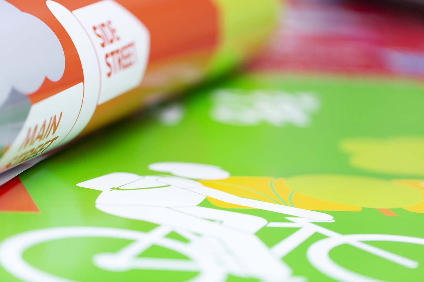
  • Use images to break up text into smaller chunks, create a sense of balance and help the flow across the poster.  

  • Using blank space can emphasise an image or text, avoids clutter and focuses on your message.

  • Leave a minimum 1.5 cm margin at the edge to help visibility and avoid the risk of content being trimmed off.  

  • A grid structure will help to align elements which makes your poster easier to read.

  • The eye looks for edges so align photos, headings, text and axes. 

  • If you have the choice a landscape poster is more comfortable to read as the majority of content is at eye level. 

Legibility - make your text work for you


x3posters
  • Aim for 300 – 600 words that are concise and to the point. 

  • Avoid font size below 24pt and use a maximum of two fonts

  • The official fonts for UCL are Helvetica or Arial for headings and Garamond for body text. 

  • Minimise the use of italics, underlining and CAPITALS 

  • Break up large areas of text.

  • Use bullet points. 

  • Slightly increasing line spacing can help clarity. 

  • Left justified text is easier to read that fully justified and avoids ugly gaps. 

  • Set headings in bold using sentence case, avoid the use of shadows and embossing.

  • To ensure accessibility, avoid the use of coloured text, try to keep to black wherever possible unless you are using a colour background.

Research Image As Art Exhibition with Woman - Large


Useful Information to help you produce your poster

Graphs and Images

  • Graphs and charts can be more effective than tables in showing data trends in numerical data. 

  • Keep graphs and charts simple – 2D is usually clearer.

  • Avoid using thin lines in any graph, it is always prudent to thicken lines and enlarge text. 

  • Use high resolution images – at least 100 ppi at full size.

  • When using images follow GDPR regulations especially where you are using images of people. Check on this website for GDPR information. 

  • All images downloaded from online sources are subject to copyright unless this has been waived and is under a Creative Commons licence. 

  • Never use images directly from a Google or similar search engine.

There are lots of free sources of imagery and Flickr and Wikimedia Commons are useful resources, however, be ultra careful and always check the copyright status of any image taken or downloaded from the web.

UCL Copyright guidelines

Information, advice and assistance, on a wide range of copyright issues for UCL students and staff, is offered by the UCL Library Services Copyright Team. Please visit their website here:


Colour

  • Please follow the official UCL colour palette set by the UCL Brand team. 

  • Ensure that it doesn’t detract from images in the body of the poster. 

  • Try not to use too many colours – 1-2 works well plus images and charts. 

  • Think about colour blindness, red, green and pink can all be hard to read. A red title on black could be illegible to some.

  • Use strong tonal contrast to help visibility e.g., dark text on a light background. Black on white is the clearest. 


Quick Guide to UCL Branding for poster design

  • Only use the UCL colour palette. 

  • The UCL banner should be set at 100% of you chosen UCL colour.  Tints of that or a complementary colour can be used elsewhere. The colour values are listed on the UCL Brand Identity website.

  • The UCL banner should be used where UCL is the major partner.

  • Never place other images or logos on the UCL banner, only the title text is allowed. 

  • If the work is an equal collaboration with other institutions or organisations, the standalone logo should be used instead with all logos placed at the bottom of the poster. 

  • Where co-branding is required then information on how to add partner logos, the size and orientation can be found on the UCL Brand website page.

  • The UCL letters on the banner/standalone logo represent a ‘window’ and as such are transparent showing the background beneath. 

  • Do not distort the UCL banner/logo. It must extend to the edge of the page. It should be resized using the corner handles. 

  • Do not change the colour of the banner, download the correct colour instead. Banners can be found on UCL Imagestore, there are links from the UCL Brand Identity website.

  • The title text should be left aligned with a clear space around the UCL cutout and portico

  • For detailed information on how to use text within the banner, including the do's and dont's, please visit this website page


Related