Close
Close

Data visualisation challenge from Energy Systems Data and Analytics MSc students
18 January 2019
UCL Energy Institute's Energy Systems and Data Analytics students were asked to create an interesting data visualisation from any available data.
ESDA Energy Data Visualisation Challenge
The Energy Systems and Data Analytics MSc programme held a data visualisation challenge for students as part of its 'Energy Data Analysis' module.
The goal was to create a single visualisation using any data they could find that revealed an insight into an aspect of the energy transition that they found interesting.
Some fantastic visualisations were created as part of the challenge, using diverse sets of data, from energy generation and storage to household consumption, revealing interesting and unusual insights.
Below are three visualisations selected from the class, including overall winner Simon Perez. Congratulations to all students who took part.
Simon Perez Arango
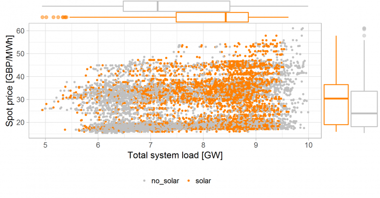
- Data
The used data set consists in the electricity generation by source, total electricity load and electricity price with an hourly resolution for the Colombian market for a year long period from 1-oct-2017 to 30-sep-2018. The data source is the electricity market operation XM (www.xm.com.co).
- Graph Motivation
The generation matrix in the Colombian power sector is hydro-dominated (80% of the total generation). This condition makes the system very vulnerable to droughts derived by El Niño phenomenon. In this events, that are becoming more frequent, the grid reliability is supported by gas-fired power plants.
In the last years the government has expressed the commitment to develop non-conventional renewable resources (mainly solar) as a complementary strategy to grid support in dry (drougths) periods. In that sense, the proposed graph intends to answer the following questions:
1. From a national perspective: Is solar supply taking place in the moments where is mostly required by the system (e.g. peak loads)?
2. From an investor perspective: Given the current market conditions, would a solar project get a larger revenue than an conventional project?
- Insights revealed
- There is no clear relation between load and electricity price. This suggests that in order to create accurate price prediction models a more complex model is required, which includes other variables (e.g. reservoir levels).
- Even though the previous insight holds, you can evidence that a high price-minimum load scenario is unlikely to happen.
- Solar generation takes place in the whole price and load spectrum.
- From the marginal boxplots, you can evidence on an extreme condition, solar supply can take place during minimum load moments in which grid stability can be compromised in an intermittent event. (this was not included in the initial hypothesis)
- There is no clear visual statistically significant difference between the mean of the prices you can obtain from solar generation and any other project. After an null hypothesis test you can confirm that the difference exists and the 95% confidence interval for the difference of the means is: [2.4 GBP/MWh, 3.2 GBP/MWh]. This would answer question 2.
- There is a clear visual difference between the the distribution of load when solar takes place and any other moment. With a null hypothesis test you can confirm result and calculate that the 95% confidence interval of the difference in the means is [0.65 GW , 0.73 GW]. This would answer question 1.
Clement Attwood
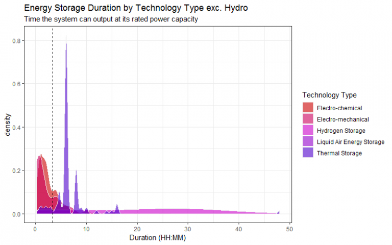
- Data
The data comes from the US DoE Energy Storage Database that list worldwide energy storage projects for all time. The data is filtered to include operational, under-construction or commissioned projects.
- Insights
The chart is a density chart of storage duration (the time over which the storage facility can discharge at the rated power). This is disaggregated by technology type as I was interested in how this duration varies across the groups. I have filtered to remove Pumped Hydro storage as the duration data is not populated/relevant in many cases. Outliers were also filtered to less than 75 hours duration.
The dashed line shows mean duration for all technologies. This is perhaps lower than I would have expected ~3 hours.
Most are skewed towards lower durations, but with long tails, showing that there is high variation within technology groups.
Thermal storage e.g. molten salt is particularly concentrated, which might suggest that there are assumptions being made (based on physical properties) about the duration of storage and applied across this group.
Hydrogen appears to have the highest duration, but you might expect this to be longer.Table from R shows mean duration for each. However, some of these are likely to be skewed.
Technology.Type.Category.2 tot_power avg_dur
1 Electro-chemical 324637 2.772207
2 Electro-mechanical 13848 12.62087
3 Hydrogen Storage 3220 17.566
4 Liquid Air Energy Storage 350 7
5 Pumped Hydro Storage 1500 6
6 Thermal Storage 39449 6.871414
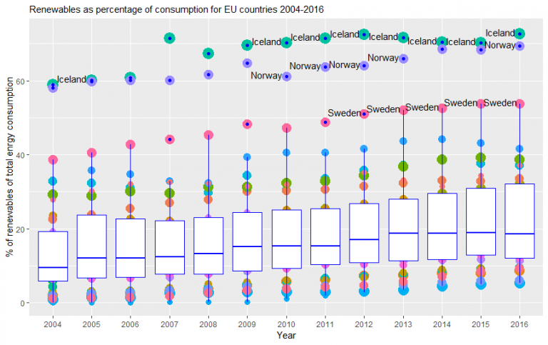
Angus Campbell
- Data
The data I used was obtained from the Euro Stat tracking the Sustainable development goals. I combined two datasets of the percentage of total energy consumption from renewables and the final energy consumptions in households per capita in kg's of oil equivalent. This was for most countries in the EU from 2004-2016.
- Graph/Insight
The graph created was a boxplot with geom_point overlaid. The boxplot shows the percentage of renewables and the points vary in size by the final energy in households per capita with larger points having greater per capita energy use.
Countries with over 50% renewables have also been named and labeled specifically with only 3 countries achieving this over the 12 years.
From the plot the only clear trend was that over there was a steady increase in the percentage of energy from renewables however surprisingly there seems to be no clear link to household energy use.