 Close
Close

Data visualisation timeline of British electricity generation sources
27 February 2018
UCL-Energy creates data visualisation timeline of British electricity generation sources over one year.
A data visualisation timeline video of the British electricity generation sources over a period of one year has been created by Aidan O'Sullivan, UCL-Energy Lecturer and Course Director for the new MSc Energy Systems and Data Analytics programme.
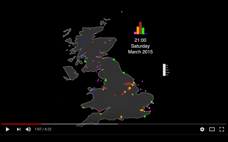
Great Britain gets its electricity from a complex array of sources with the amount coming from, gas, nuclear, coal, wind and hydro, varying by the day and by the way. In this visualisation we show all the sites generating at least .1% of GB’s electricity in an hour and the mix of fuels that make up the supply.
The geographic distribution of the generating sites highlights where Great Britain’s renewable generation is concentrated, up north, and where the bulk of the Gas generation sites are concentrated, down south, and the variability of these sources in contrast to more consistent generation sites such as nuclear and coal. It also highlights how hydro electricity is used at times of peak demand and the changing energy mix throughout the year.
The visualisation shows hourly data from a randomly selected week for every month from January 2015 to May 2016.
The UCL Energy Institute is launching a new postgraduate programme to tackle energy system issues through data analytics - learn more here.