 Close
Close

Reasoning about urban communities
31 January 2017
On 26 January, Dr Jamie O’Brien led a proof-of-concept workshop with design and planning participants from Urbed.
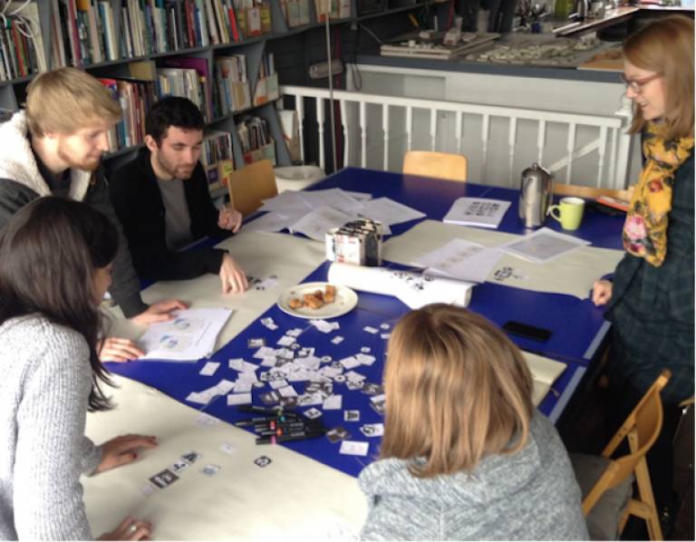
The participants looked at mapped data from CASA’s current research project, ‘Visualizing Community Inequalities’ (supported by the Leverhulme Trust), and used a set of graphic icons to think about the spatial and social relationships suggested by the data. The workshop tested ways in which visual tools can support our reasoning about mapped data, and to find out how they could help us to discover new patterns and relationships.
The graphic icons helped the participants to describe the various spatial structures and scales of movement that communities use to define their locations in urban space. The participants also used graphic representations of spatial logics (based on the RCC language) to describe ways in which these structures and scales might be arranged. Each of the participants was able to find patterns within the mapped data, and to build a ‘concept graph’ of community formations, incorporating structures, scales and spatial relationships. Jamie is now looking forward to developing this graphic tool through a series of follow-up workshops.
The mapped data was based on participatory data-gathering workshops with secondary school-age children across Liverpool (collected early in 2016). These workshops invited the children to respond to three questions: What features of your local area help people come together. What features make this more difficult? Where in your local area do different people interact? The participants selected and weighted these features by applying emoticons to local maps (1 mile sq surrounding their school). These where then scanned into QGIS and digitized, and the points data were manipulated in an RStudio environment to produce a series of visualizations.
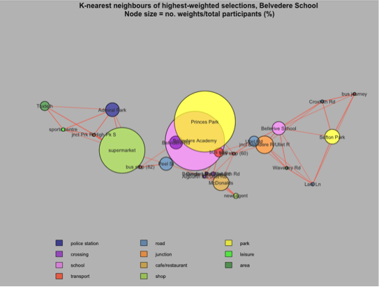
Geo-coordinated Knn graphs representing the significance of selected features by weight and closeness
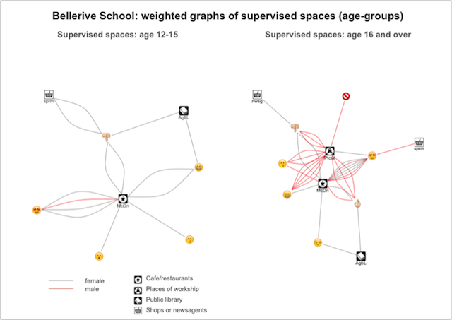
Force-directed graphs representing how weights are connected by participants to selected features
Force-directed graphs representing how weights are connected by participants to selected features
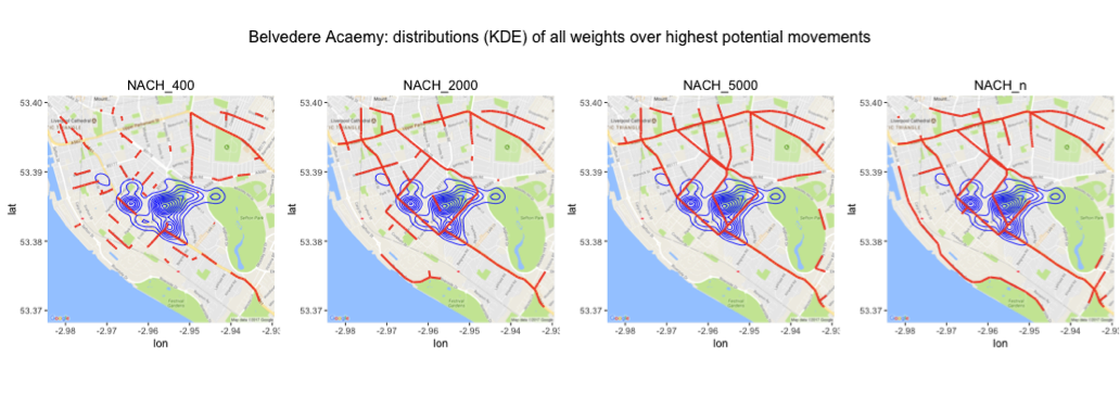
KDEs of aggregated points data, representing community presence, over model arrays of movement potentials (the highest likelihood of pedestrian or automotive traffic at various scales)
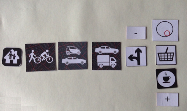
Another example of a concept graph, representing a journey from home (left) to a supermarket (right), which crosses busy roads with local and city-wide traffic. The supermarket has a café represented using an RCC icon (here, a ‘tangential proper part’)
An example of a concept graph, representing a journey from home (left) to a supermarket (right), which crosses busy roads with local and city-wide traffic. The supermarket has a café represented using an RCC icon (here, a ‘tangential proper part’)