


A ramble on UCL’s corporate identity guidelines
There is nothing on earth more exquisite than a bonny book, with well-placed columns of rich black writing in beautiful borders, and illuminated pictures cunningly inset. But nowadays, instead of looking at books, people read them. A book might as well be one of those orders for bacon and bran that you are scribbling.
Scene IV, Saint Joan, George Bernard Shaw

It has come to my attention that I have somehow developed a bit of a reputation as a shameless font geek. Although the reputation was originally an exaggeration of the reality (I think it sprang from me off-handedly voicing an appreciation of Gill Sans), my natural fear of not being able to live up to the hype led to a spiral of typographical consumption resulting in some actual knowledge of the field.
As a warning, interest in typography is a double-edged sword. Since type surrounds us, the little extra insight and knowledge opens up a new world with every printed thing you read or see on the street. The structure of nicely-set adverts on the tube make waiting for the train a little more bearable and books can be enjoyed aesthetically without even having to read them. Ditto for scientific papers, though it might help your PhD if you do. On the other hand, initiation into the rules of good typography mean that bad design decisions stick out more glaringly than ever before. This can induce mild headache in extreme cases but I'm worried that if I develop any more typographical abilities then fake small caps could be enough to induce a stroke; the effects of Comic Sans I don't even want to consider. I almost gave up reading quite a good book recently because of what I thought was inappropriate use of bold weight text.
So I thought that the UCL corporate identity guidelines might be deserving of a little critique. With regard to typefaces, UCL asks people to use Arial as a general sans-serif and ‘Garamond’ as a ‘secondary typeface’ for body text.
I think it's great that UCL goes to the trouble of explaining design guidelines to staff and students, in order to get a consistent look and feel for printed matter coming out of the university, but there are some interesting controversies behind the two recommended typefaces which might be of interest, even to people who aren't really sure about the difference between a serif and a sans.
Arial
Arial is, to many people, the default sans-serif. So it makes sense to recommend it for use at university: all computers will have it, it's a core web font (so you can use it on websites as well as print material) and it's pretty readable and unobtrusive. To typographers, though, Arial is a charlatan. Arial basically piggy-backed on the popularity of Helvetica, a Swiss sans-serif that pretty much was the only font used in advertising from the mid-60s to early 70s. The popularity of Helvetica led to a bunch of cheaper knock-offs, including Arial, which Microsoft opted to bundle as a default font in Windows 3.1. As desktop publishing took off, Arial started to appear instead of Helvetica, earning itself a dubious reputation through ubiquity rather than merit. Arial apes the proportions of Helvetica, meaning they look the same at a distance, but lacks the finesse of Helvetica's letterforms, which becomes obvious when you look closer or if it is used in titling or signage.

How do you spot the difference between Arial and Helvetica? A design feature of Helvetica is that all of the terminals (ends of strokes) are either horizontal or vertical. In Arial, we see sloping terminals, which are clear on the top of the lower case t and at the ends of the c. Helvetica also has a capital R with a nicely poised leg, whereas Arial's lounges like a cowboy, often bumping into the following letter.
‘Garamond’
The thing about Garamond is that it isn't a typeface. It's a genre of typefaces which supposedly reference type cut by Claude Garamond in the 15th century. What makes this more confusing is that some of the Garamonds don't look much like Garamond's type, and are in fact based on type designed by a later punch-cutter called Jean Jannon.
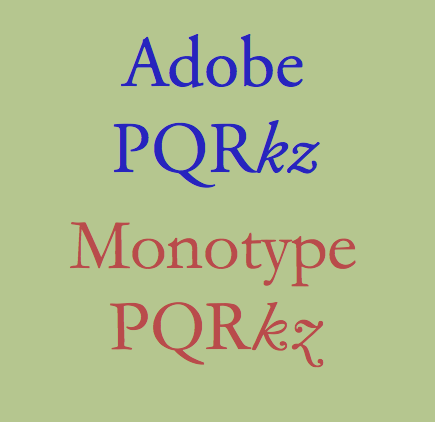
OK, so we accept that the naming is a bit dubious to start off with. But there are at least five different mainstream typefaces called Garamond: Monotype Garamond, ITC Garamond, Stempel Garamond, Adobe Garamond and Simoncini Garamond, with a whole bunch of other interpretations floating around. Of the five above, Adobe Garamond and Stempel Garamond are actually based on Garamond letterforms, whereas Monotype Garamond and Simoncini Garamond are based on Jannon letterforms (thinner strokes and serifs and quite schizophrenic italics with varying slope). ITC Garamond used the name but didn't really draw inspiration from either historical source and is notable for having much shorter ascenders and descenders than the others. It is Garamond's dumpy younger brother, wearing 70s flares and a medallion. Apple used a condensed version of ITC for a while but it is poorly-regarded by most current designers. In this blog post, several of todays leading type designers line up to rant about how bad it is.
Although UCL print material is nearly all in Arial, I managed to find an official document with some Garamond on, which revealed that the interpretation they were referring to was the Adobe version. Thankfully this is one of the more readable and attractive flavours but someone who didn't know about the above issues might end up using the less readable Monotype version (which comes pre-packed with Microsoft Office ... notice a trend?). In a situation where you have a group of people contributing to a document, you might end up with different Garamond versions in each section, or mismatching on the same page.
Now I have to say that UCL's design department actually produce very nice-looking publications. But these are professionals who know how to mitigate the ugly features of Arial (at a smaller size they are less noticeable and, thankfully, the logo doesn't feature Arial's horrendous R), and clearly have one of the nicer Garamond interpretations to hand. The problem is that, with Arial, the CI guidelines force an awkward typeface onto unprofessional users, who will probably end up making something that looks very, well, MS Office default. As an aside, I've seen quite a lot of Helvetica on official UCL signs and posters so someone in the design department must be making a stand. With the serif text, at least they've gone for (Adobe) Garamond instead of Times New Roman (another evil default), but the ambiguity about which actual typeface they mean could lead to a pretty inconsistent visual appearance.
If you've made it this far without exploding, there's no saving you. Read this book and welcome to the dark side...