 Close
Close

Students create spatial visualisations using energy data
31 March 2021
As part of the Energy Systems and Data Analytics MSc our students responded to a spatial data visualisation challenge, using geospatial data to create a series of maps on issues relating to energy, transportation and climate change.
Students on the Energy Systems and Data Analytics MSc (ESDA) used the spatial data visualisation challenge as an opportunity to use diverse sets of geospatial data related to energy, transportation and climate change from across the globe to create a range of map visualisations on topics from fire vulnerability and solar power, to Global Warming challenges and fuel poverty. Set as part of the Spatial Analysis of Energy Data module, the challenge asked the students to communicate complex spatial dynamics around the energy systems with a map minimising the use of text. This required the students to be empathic with the potential map users, synthesise data to key useful information and developing supportive aesthetics.
This article showcases the top five maps submitted for the 20/21 year with an author’s commentary to set the for each map. You can view the complete range of maps created by our third ESDA cohort on github.
Jump to the top five maps:
- The Vulnerability of California’s Electrical Grid to Fire-Induced Power Outages
- Household fuel poverty in England
- Global Warming Challenges in West Africa by 2050
- Belgian Nocturnal Luminosity Compared with Population Density
- Coal Electricity Production in Europe
The Vulnerability of California’s Electrical Grid to Fire-Induced Power Outages

Author: Mila Stieglitz-Courtney
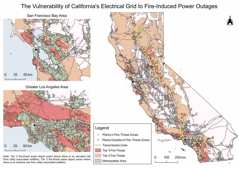
In the context of growing wildfire risks to California’s electrical grid, the map sought to identify the vulnerability of the state's power plants and transmission lines to fire-induced power outages based on their location in fire-threat zones. While initially the project focused on anticipating public-safety power shutoffs, it was later broadened to investigate how fire-threat maps might help inform the optimal placement of distributed energy resources (DERs), such as off-grid solar photovoltaics (PVs), which are cleaner alternatives to diesel generators for backup power during extreme weather events and can contribute to the state's emissions reduction targets.
One of the largest challenges of the project was finding open-source geospatial data on wildfire risk. Another challenge was if, or how, to incorporate a visualisation of high solar-potential zones to enhance the argument that solar PVs could be a good way of bolstering energy security during blackouts. Ultimately, it was decided to omit this component for ease of visualisation. Overall, the project was incredibly enriching, and I hope to continue exploring this very important area of research in the future!
View the full-size visualisation (4.4 MB)
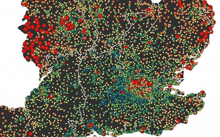
Household fuel poverty in England
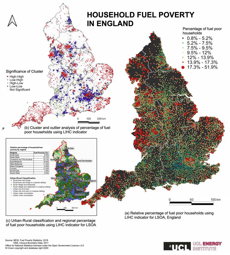
This map is set to understand the spatial distribution of fuel poverty households using a Low Income High Cost (LIHC) indicator, focusing upon England. Specifically, the three maps presented in this coursework provide information concerning (a) the general patterns in the spatial distribution of fuel poverty households; (b) spatial clusters and outliers of fuel poor households; (c) the geographical features (urban and rural) associated with the fuel poverty indicators.
View the full-size visualisation (4.3 MB)
Global Warming Challenges in West Africa by 2050
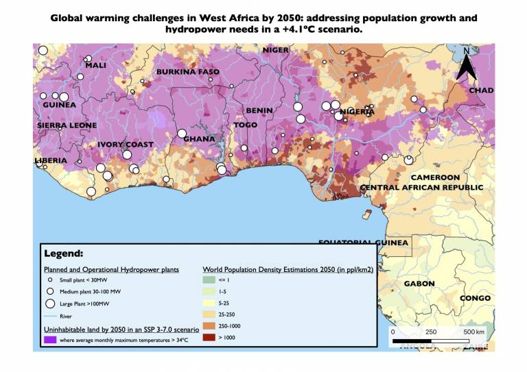
The map is based on a moderate Shared Socioeconomic Pathways (SSP) 3-7.0 scenario, which assumes that the world has failed to enact any climate policy. The scenario bases its estimates on a world where global temperatures have risen by an average of 4.1°C. At this rate, temperatures would force humans away from equatorial regions. West Africa highlights the impacts of this phenomenon, being one of the warmest regions on Earth. The purple area shows the region where the average monthly maximum temperature would reach more than 35°C, at which humans and animals die from hyperthermia if they stay outside for a few hours, hence rendering the region in question uninhabitable. In addition, those countries would be pervaded by drought, which would make agriculture and breeding impracticable, pushing the populations to migrate to cooler territories.
What’s more, from a resource perspective, such temperatures would require drastic changes to the region’s energy supply. In Sub-Saharan Africa, hydropower accounts for over 50% of the total power supply, and as can be seen on the map, the largest hydropower plants are located inland, particularly in the purple zone. Considering the SSP 3-7.0 scenario, it is certain that most rivers in the region would dry out, and rainfalls would become highly irregular, resulting in more variability in hydropower capacity factors. It is therefore essential for countries to introduce resilience measures as well as diversify their energy sources to cope with the potential extreme weather.
View the full-size visualisation (414 KB)
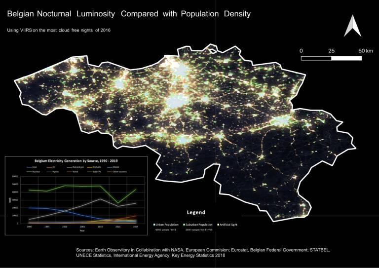
Belgian Nocturnal Luminosity Compared with Population Density

The map shows the wasteful light pollution occurring in Belgium as well as the impacts it may have on the local population. The hardest part of the project was acquiring the data.
View the full-size visualisation (215 KB)
Coal Electricity Production in Europe
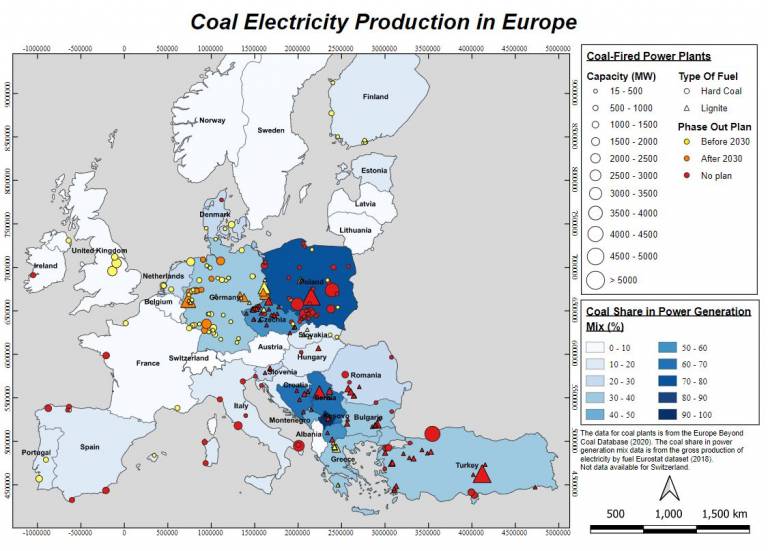
Historically, Europe has been very reliant on coal for its energy production, at great costs for the environment and human health. However, European countries now have to phase-out coal to meet climate change related policy. This map aims to provide an overview of coal power dependencies in Europe and future phase out commitments. It can be noticed that coal still accounts for a significant share of the power generation mix for many European countries, with Germany, Poland, and Turkey having the most capacity installed in 2020. Although the majority of coal power plants do not have phase out plans, it can be seen that countries are planning to shut down their plants in the near future. Taking the example of Germany, this raises important financial and energy security questions with respect to the alternatives it will use to replace 39% of the electricity generated by coal-fired power plants in 2018.
View the full-size visualisation (156 KB)