 Close
Close

Energy Systems & Data Analytics MSc students showcase skills in spatial data visualisation challenge
26 June 2020
UCL Energy Institute students responded to a spatial data visualisation challenge as part of a module on Energy Data Analytics.
Students on the Energy Systems and Data Analytics MSc used the challenge as an opportunity to use diverse sets of data from across the globe to create a range visulations on topics from nuclear power, to Net-Zero capabilities, to renewable energy.
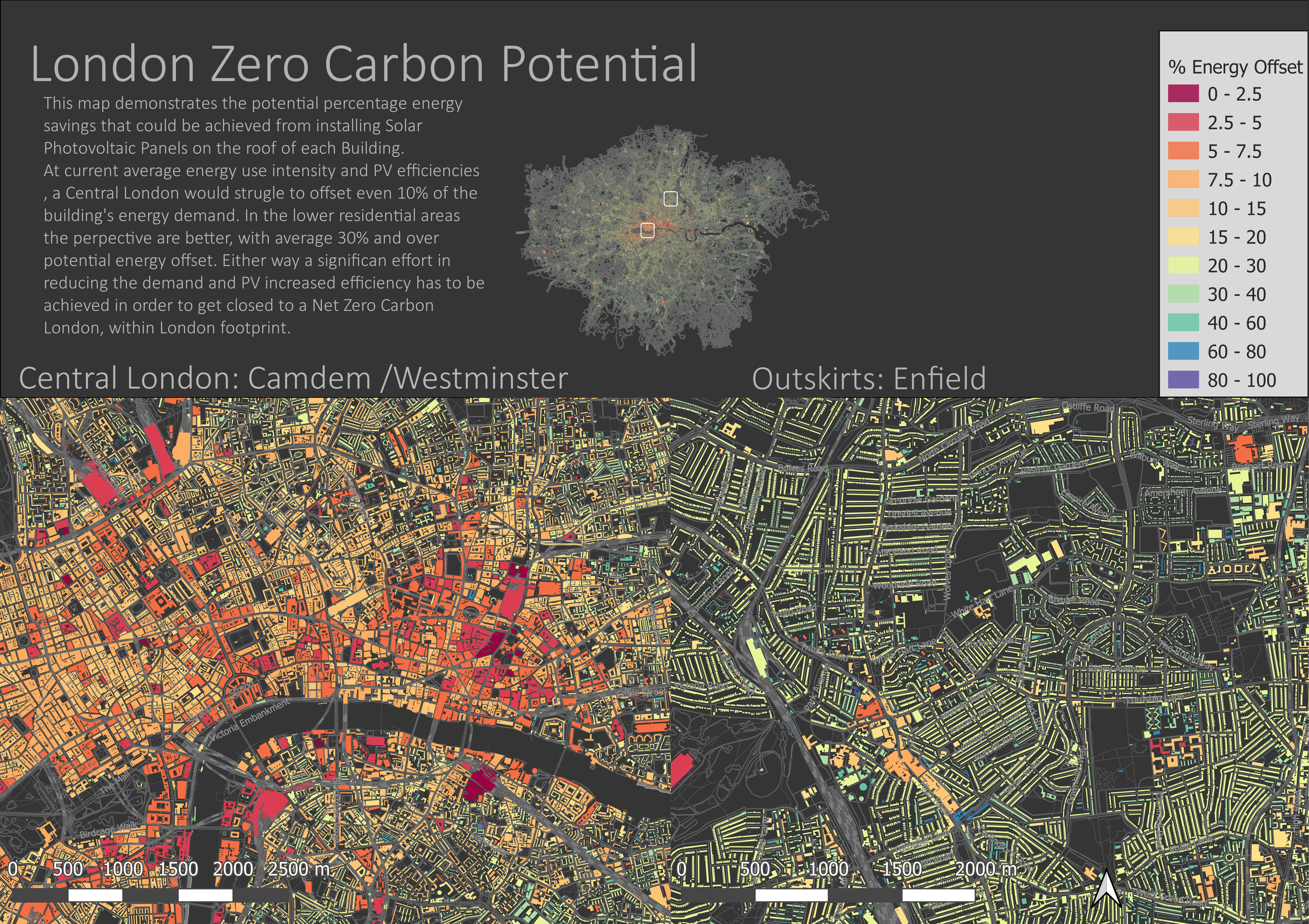
London zero carbon potential
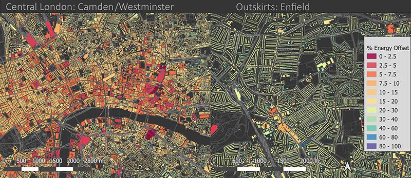
This map demonstrates the potential percentage energy savings that could be achieved from installing Photovoltaic (PV) Panels on the rooftop of every building in London. At current average energy use intensity and PV efficiencies, it would be challenging to achieve 10% savings in central London and 30% in lower residential areas. A significant effort in reducing energy demand together with on-site and off-site renewable energy is necessary to achieve a Zero Carbon London.
Santiago Velez
View the full-size visualisation (6.68 MB)
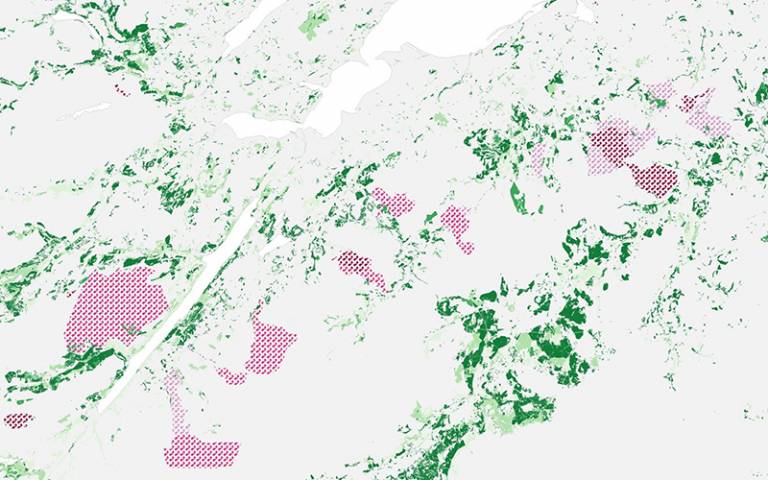
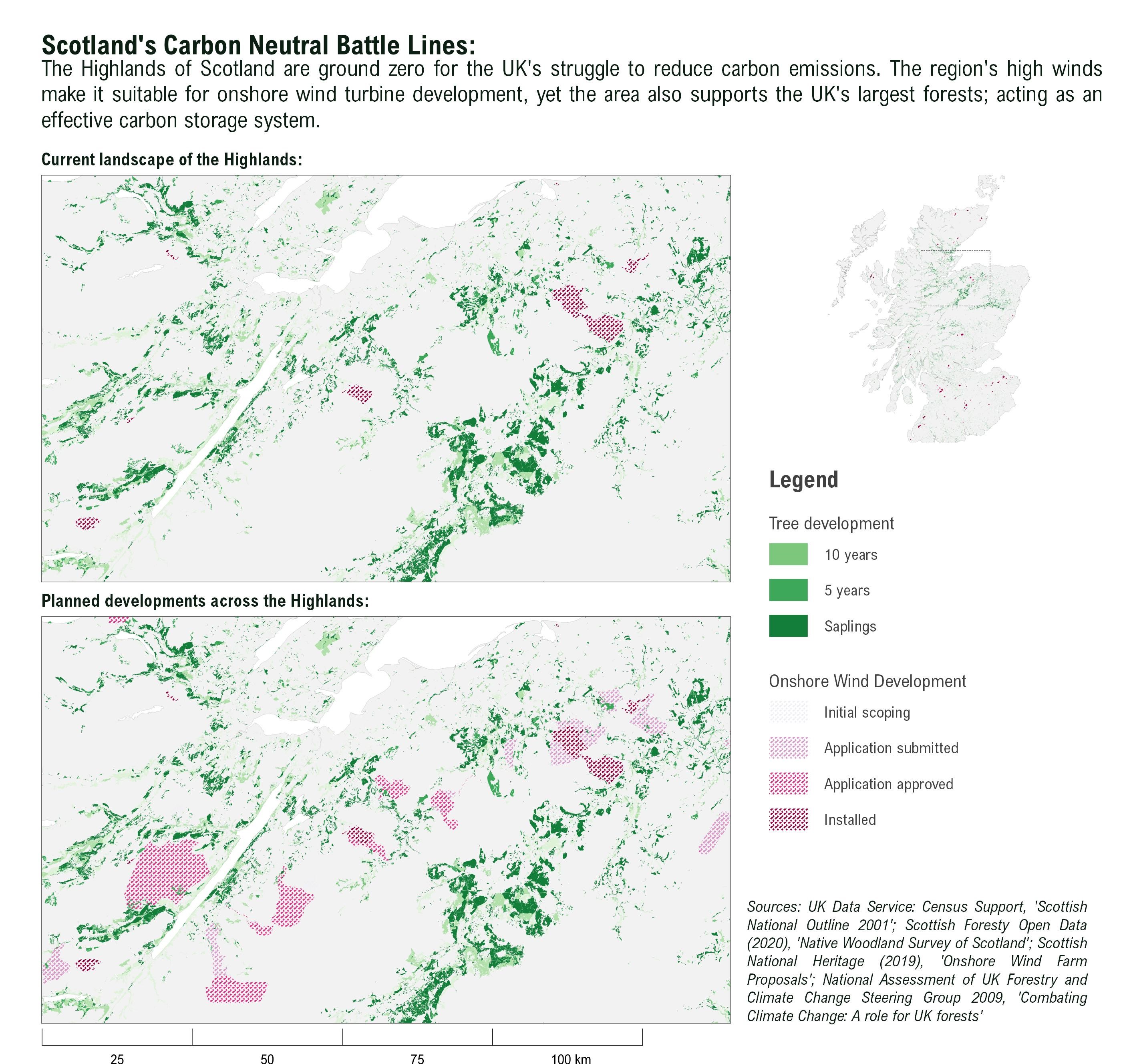
Scotland’s carbon neutral battle lines
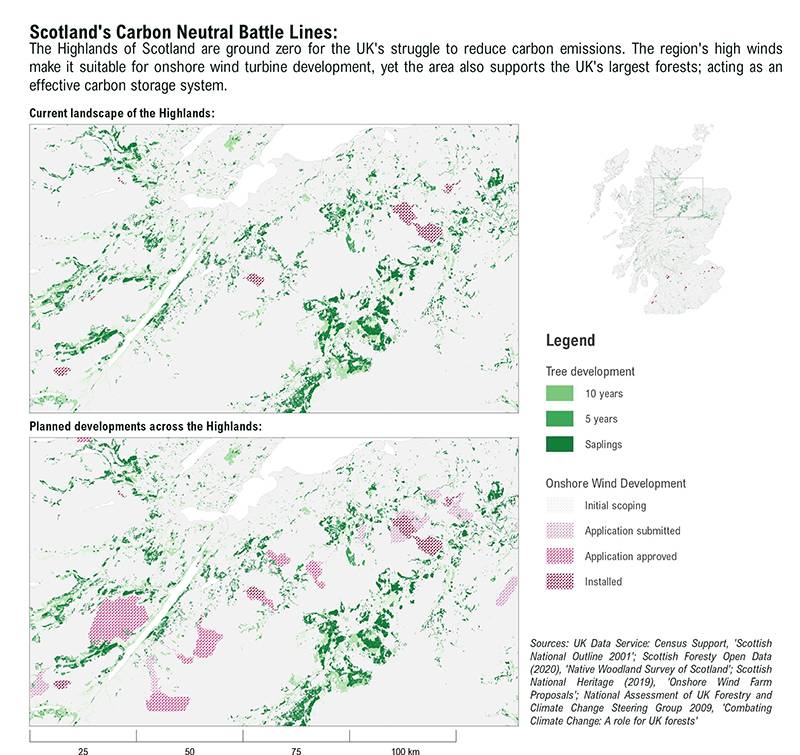
The map focuses upon a trade-off causing much debate across the highlands of Scotland – which pertains the focus of environmental policy, the restoration of forests or onshore wind-farm development? The categorisation of trees by age corresponds to the potential for carbon storage, for instance, saplings will capture greater levels of CO2 over the next 20 years than older trees. Viewing this debate through a spatial lens is, in my opinion, a more powerful way to illustrate the balance (or imbalance) between infrastructure and forest development. Land use is difficult to perceive through figures and charts, it is more emotive and relatable for the reader to see changes occurring on a map. Perhaps even more challenging is demonstrating how reforestation can be an effective tool for capturing carbon dioxide. Determining the sequestration rates of trees to reflect carbon storage potential was the biggest challenge when creating the map – it was important to classify the age and type of tree with the correct abatement rates and there is a degree of uncertainty when doing so, given the granularity of the data. Hopefully, the map presents the reader with a more informed view of the on-going landscape changes across the highlands.
Calum Gibson
View the full-size visualisation (1.16 MB)
New Zealand offshore wind farm site suitability
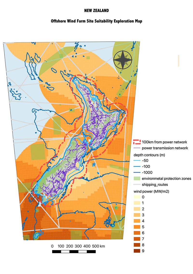
This map provides information for preliminary site suitability analysis for offshore wind energy in New Zealand. Exclusion zones (environmental protection zones and shipping lanes) are displayed to show areas not suitable for wind development. The map also displays wind power potential, water depth, and the national grid to help identify potential sites with strong wind conditions, suitable water depth for offshore installation, and access to power lines. The analysis was also extended to consider offshore wind-powered hydrogen production. The dotted red line shows the distance offshore (100km buffer from the power grid) beyond which power-to-gas only platforms should be considered, due to high costs of underwater electrical connection.
Ting Cooper
View the full-size visualisation (0.9 MB)
Renewable energy evolution in Chile
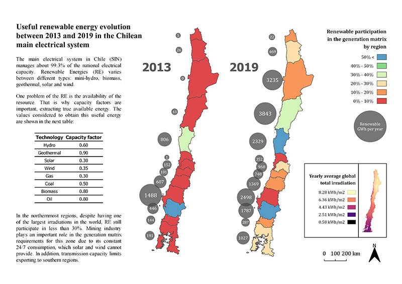
The highlight is that the map shows a simple way of seeing the evolution of renewables at a regional level. This type of map would be useful for professionals and policymakers who have previous information about energy resources by region and want to understand how the potential has been exploited.
Felipe Riquelme Larenas
View the full-size visualisation (0.9 MB)
Nuclear power in South Korea
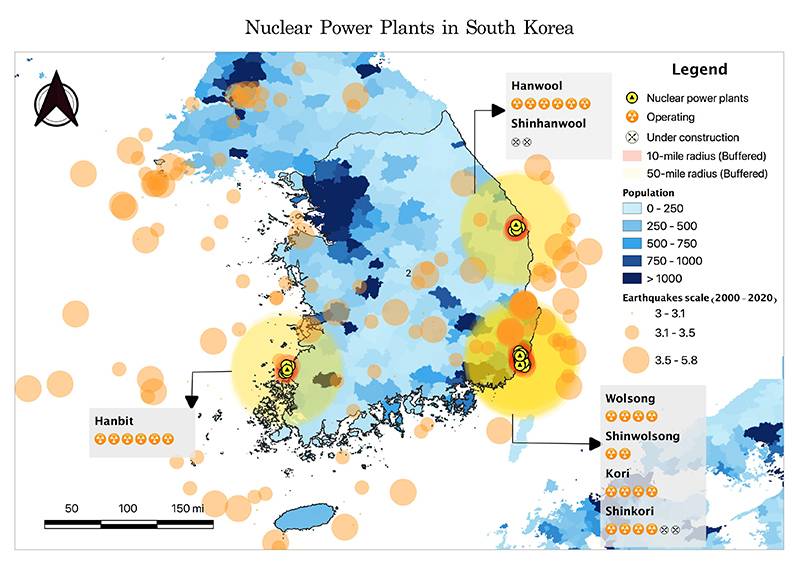
Southern regions of Korea, which are found suitable for nuclear power generation, show a very high concentration of nuclear power plants. This might put millions of lives under threat in case of an incident as this overlaps with populated regions. The range of the risk is visualised as 10-mile and 50-mile buffers, which designates Exposure Pathways. Moreover, the trend in earthquake and proximity shows that there is a possibility that plants will be affected by earthquakes.
In particular, the southeast part of the peninsula is marked with the highest frequency and magnitude of the earthquakes, the highest concentration of the plants and the highest population density. This indicates that this area is associated with the biggest danger, therefore actions to minimise the risks need to be taken immediately.
The challenge, however, was to express the multi-layered risks and their magnitude at the same time. I managed it by using buffers and visualising the overlapping of multiple components. Plus, it would have been a great adjustment to add the recent increasing trend of earthquakes visually.
Jihae Ko
View the full-size visualisation (0.6 MB)