Improved SI Image Recovery
In the previous installment, we used an
ideal OTF to simulate the use of structured illumination to eliminate out of
focus emissions and get some very crude improvement in lateral resolution. This
time out, we're going to make the process work a little better and try it out on
a slightly more plausible test image.
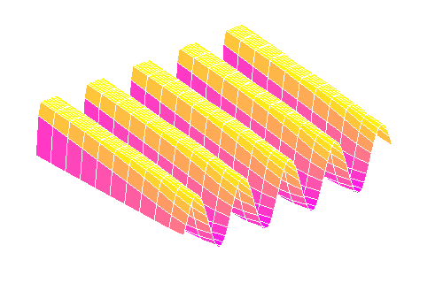
The first thing we're going to do is switch from a sine grating to a rectangular
pulse pattern. There are several reasons for this. For one thing, a rectangular
grating is going to be a lot easier to generate when we start using liquid
crystal componentry, which almost always consists of an array of rectangular
pixels. For another, it allows for better separation between the bright and dark
regions of the focal plane. However, there's a problem.
The sharp edges of a rectangular grating pattern constitute high frequency
components, and won't be faithfully transmitted by the OTF. For cases where the
grating frequency itself is very low compared to the OTF's cutoff, this effect
is more or less negligible -- you're unlikely to notice diffraction blurring
between the stripes of a zebra crossing or the squares on a nearby chessboard.
But as the bands get narrower and narrower, approaching the diffraction limit,
the edges become less and less clear, until the pattern is pretty much
equivalent to a sine grating anyway:
(In this figure, the OTF cutoff frequency is reduced rather than the grating
wavelength, to make the effect more visible, but it adds up the same thing.)
Now, as it happens, to get the maximum resolution improvement from our
illumination scheme, we want the grating frequency to be fairly close to the
cutoff, so even if we're actually using a rectangular pattern, we're never going
to get perfect separation. This has some implications for our reconstruction
algorithm.
Recall that our primary goal was to separate the constant unfocussed image from
the variable focussed one, and to do that we applied this formula:
This equation is equivalent to calculating the diameter of a circle that is some
distance off the ground, based on the apparent heights of three points
equally-spaced around its rim. This works pretty well provided (i) it really is
a circle and (ii) the points really are equally spaced. If these assumptions
fail -- which is to say, if the pattern is not a perfect sine wave or the three
images are not separated by exactly a third of a cycle -- then we start to get
banding artefacts.
When the above formula is applied to a square wave, it also gives the correct
answer, because it reduces to a somewhat different calculation. In this case, it
tells you the distance from the top of the wave to the bottom. We can make this
calculation simpler, though, by doing it explicitly, like this:
This is actually rather more intuitive in terms of what we want: just the
foreground without the background. As a bonus it's also more computationally
efficient, robust to uneven phase shifts and very easy to generalise to any
number of sample frames.
Needless to say, there's a problem.
Since this formula is subtracting the dark from the light, it depends on there
being an adequate separation between those two states. For anything other than a
rectangular wave pattern, this will not be the case; and we've already
established that our hard-edged rectangular pattern goes all mushy as it passes
through the OTF. So not all points in our image will be sampled across the same
light range, and there will be some light-dark banding over the image.
There are two things we can do to improve this: we can increase the distance
between the light bands in our pattern, and we can increase the number of sample
frames we take over a single cycle. For the moment let's gloss over the some of
the practical considerations and just assert that we'll use a 2:1 pulse pattern
(ie, the dark bands are twice the width of the light), and continue to take just
three frames in each direction.
Revisiting our old target pattern with this updated strategy, let's see what we
get. Here's a trio of frames taken with the 2:1 grating:
And here are two images generated from vertical and horizontal sets using
slightly different applications of the max-min approach:
The image on the left takes the max-min over all six frames. This has a tendency
to darken the midtones and also to introduce some nasty diagonal artefacts. The
one on the right takes the max-min separately for each direction and then adds
those results together. This allows for artefacts from one direction to be
compensated for in the other. It should also somewhat ameliorate noise problems,
which we aren't looking at today but will come back to next time. The
differences are not that obvious in these images, but as we'll see below the
second approach is actually much more promising.
Out target image so far has been tailored to testing the frequency response, but
it doesn't bear much resemblance to any biological sample we'd actually want to
look at with fluorescence microscopy. As such, it doesn't necessarily tell us
much about how useful our putative techniques might be. It's perfectly possible
that some of the improvements we see in the target may be specific to regular
patterns of parallel lines and not generalisable to the features found in
natural specimens. So, let's introduce a different and hopefully more
informative target:
OK, this isn't as neat and pretty as the last one, and is still massively
simplified in comparison to an actual cell culture or whatever, but it does
include several features of specific relevance to our task:
As you can see, we're not losing anything much on the gross structure and even
most of the blobs are still distinct. But check out the smudge of smaller grey
dots in the upper left; around the larger white blob in the top middle; and in
the central disc of the pattern to the lower right. Pretty much lost, right? So
what does our new SI technique give?
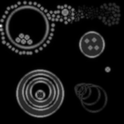
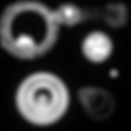
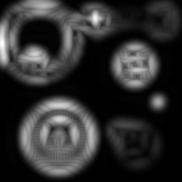
As before, the left is max-min for the full set, right is the verticals and
horizontals processed separately and then added. Both formulæ manage to
recover more dot detail, and generally sharpen things up a bit. But the diagonal
artefacts mentioned before are quite pronounced in the left image -- the
verticals and horizontals are overemphasised at the expense of the other
directions -- and it isn't as successful at separating the dots.
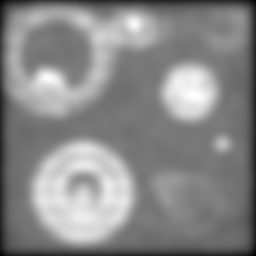
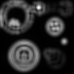
Let's make the OTF more restrictive and see what happens:
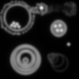
Note that we've coarsened the illumination pattern in order to get it through
the OTF. In the conventional (but clean) upper-left image, we're really starting
to lose most of our blobs -- only the biggest can still be clearly
distinguished. And the superiority of the two-stage reconstruction is becoming
obvious: the exaggerated directions are really starting to confound the lower
left image, smearing together blobs that ought to be distinct. By contrast, the
grey blobs in the upper right corner and the white ones in the upper left and
middle of the lower right hand image are most fairly well separated and
countable.
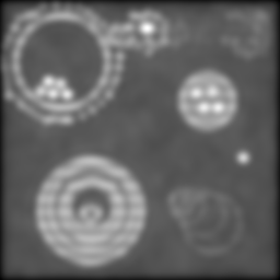
Making things worse still:
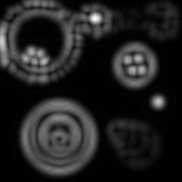
And again:
By this point, things have gotten pretty ugly. But still, the two-way composite
is giving us information that just isn't there in the others. No amount of
unsharp mask filtering on the conventional image is going to give us the
separation we're still sneaking out via structured illumination.
Which is pretty cool.
But I have an admission to make.
The optical sectioning mechanism is clear enough. And I understand how the SI
pattern manages to encode higher levels of lateral detail for transport through
the OTF. But I haven't a clue how that detail is being recovered here.
At least, not one I can express with any degree of rigour.
All of the analyses of this business that I've seen require some not necessarily
complicated but at least deliberate manœuvring to pull out the high
frequencies and shift them back to their correct locations in Fourier space.
That is not happening in this case. The image recovery is really simple
arithmetic. There's no specific deconvolution or phase shifting going on. It's
just magic.
Magic is inherently untrustworthy, so at the moment I'm trying, without evident
success, to put this on a firmer footing.
In the meantime, I feel reasonably confident that the whole process will get a
lot more plausibly-ineffectual when I start taking into account noise and
aberrations...
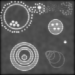
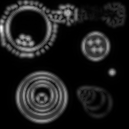
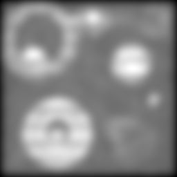
- The bulk of it is black; the 'fluorescent' parts of it are relatively sparse, as we would typically hope to be the case for tagged biological samples.
- There are different levels of intensity (equivalent to fluorophore concentrations).
- There are different levels of detail: big bits and small bits.
- There are objects inside other objects.
- There are curves. Biological entities are rarely rectilinear.