- Introduction
- 1. Introduction to Quantitative Analysis
- 2. Descriptive Statistics
- 3. T-test for Difference in Means and Hypothesis Testing
- 4. Bivariate linear regression models
- 5. Multiple linear regression models
- 6. Assumptions and Violations of Assumptions
- 7. Interactions
- 8. Panel Data, Time-Series Cross-Section Models
- 9. Binary models: Logit
- 10. Frequently Asked Questions
- 11. Optional Material
- 12. Datasets
- 13. R Resources
- 14. References
- Published with GitBook
6. Assumptions and Violations of Assumptions
6.1 Seminar
Setting a Working Directory
Before you begin, make sure to set your working directory to a folder where your course related files such as R scripts and datasets are kept. We recommend that you create a PUBLG100 folder for all your work. Create this folder on N: drive if you're using a UCL computer or somewhere on your local disk if you're using a personal laptop.
Once the folder is created, use the setwd() function in R to set your working directory.
| Recommended Folder Location | R Function | |
|---|---|---|
| UCL Computers | N: Drive | setwd("N:/PUBLG100") |
| Personal Laptop (Windows) | C: Drive | setwd("C:/PUBLG100") |
| Personal Laptop (Mac) | Home Folder | setwd("~/PUBLG100") |
After you've set the working directory, verify it by calling the getwd() function.
getwd()
Now download the R script for this seminar from the "Download .R Script" button above, and save it to your PUBLG100 folder.
# clear environment
rm(list = ls())
Required Packages
Let's start off by installing two new packages that we are going to need for this week's exercises. We'll explain the functionality offered by each package as we go along.
install.packages("lmtest")
install.packages("sandwich")
Now load the packages in this order:
library(lmtest)
library(sandwich)
library(texreg)
library(dplyr)
Omitted Variable Bias
 Ice Cream and Shark Attacks
Does ice cream consumption increase the likelihood of being attacked by a shark? Let's explore a dataset of shark attacks, ice cream sales and monthly temperatures collected over 7 years to find out.
Download 'shark_attacks.csv' Dataset
shark_attacks <- read.csv("shark_attacks.csv")

head(shark_attacks)
  Year Month SharkAttacks Temperature IceCreamSales
1 2008     1           25        11.9            76
2 2008     2           28        15.2            79
3 2008     3           32        17.2            91
4 2008     4           35        18.5            95
5 2008     5           38        19.4           103
6 2008     6           41        22.1           108
Run a linear model to see the effects of ice cream consumption on shark attacks.
model1 <- lm(SharkAttacks ~ IceCreamSales, data = shark_attacks)
screenreg(model1)
========================
               Model 1
------------------------
(Intercept)     4.35
               (5.24)
IceCreamSales   0.34 ***
               (0.06)
------------------------
R^2             0.29
Adj. R^2        0.28
Num. obs.      84
RMSE            7.17
========================
*** p < 0.001, ** p < 0.01, * p < 0.05
Let's check pairwise correlation between ice cream consumption, average monthly temperatures and shark attacks.
cor(select(shark_attacks, SharkAttacks, Temperature, IceCreamSales))
              SharkAttacks Temperature IceCreamSales
SharkAttacks     1.0000000   0.7169660     0.5343576
Temperature      0.7169660   1.0000000     0.5957694
IceCreamSales    0.5343576   0.5957694     1.0000000
It looks like there's high correlation between average monthly temperatures and shark attacks, and also between ice cream consumption and monthly temperatures, so let's add the Temperature variable to our model.
model2 <- lm(SharkAttacks ~ IceCreamSales + Temperature, data = shark_attacks)
Now compare it to the first model.
screenreg(list(model1, model2))
===================================
               Model 1    Model 2
-----------------------------------
(Intercept)     4.35       0.57
               (5.24)     (4.31)
IceCreamSales   0.34 ***   0.10
               (0.06)     (0.06)
Temperature                1.29 ***
                          (0.20)
-----------------------------------
R^2             0.29       0.53
Adj. R^2        0.28       0.52
Num. obs.      84         84
RMSE            7.17       5.84
===================================
*** p < 0.001, ** p < 0.01, * p < 0.05
The second model shows that once we control for monthly temperatures, ice cream consumption has no effect on the number of shark attacks.
Heteroskedasticity
In order to understand heteroskedasticity, let's start by loading a sample of the U.S. Current Population Survey (CPS) from 2013. The dataset contains 2989 observations of full-time workers with variables including age, gender, years of education and income reported in hourly earnings.
Download 'cps2013.csv' Dataset
cps <- read.csv("cps2013.csv")
head(cps)
  age gender education    income
1  30   Male        13 12.019231
2  30   Male        12  9.857142
3  30   Male        12  8.241758
4  29 Female        12 10.096154
5  30   Male        14 24.038462
6  30   Male        16 23.668638
Now plot income by years of education.
plot(income ~ education, data = cps)
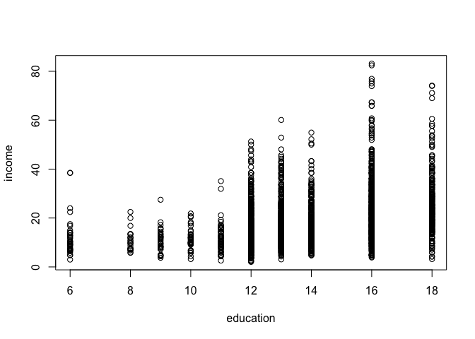
We can see that the range of values for income have larger spread as the level of education increases. Intuitively this makes sense as people with more education tend to have more opportunities and are employed in a wider range of professions. But how does this larger spread affect the regression model?
Let's run linear regression and take a look at the results to find out the answer.
model1 <- lm(income ~ education, data = cps)
summary(model1)
Call:
lm(formula = income ~ education, data = cps)

Residuals:
    Min      1Q  Median      3Q     Max
-23.035  -6.086  -1.573   3.900  60.446

Coefficients:
            Estimate Std. Error t value Pr(>|t|)
(Intercept) -5.37508    1.03258  -5.206 2.07e-07 ***
education    1.75638    0.07397  23.745  < 2e-16 ***
---
Signif. codes:  0 '***' 0.001 '**' 0.01 '*' 0.05 '.' 0.1 ' ' 1

Residual standard error: 9.496 on 2987 degrees of freedom
Multiple R-squared:  0.1588,    Adjusted R-squared:  0.1585
F-statistic: 563.8 on 1 and 2987 DF,  p-value: < 2.2e-16
The model tells us the for each additional year of education, the income increases by 1.756.
Now let's plot the fitted model on our scatter plot of observations.
plot(income ~ education, data = cps)
abline(model1, col = "red")
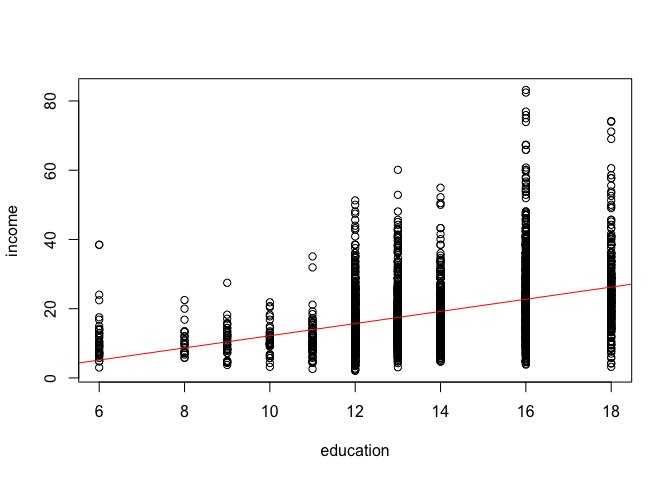
Looking at the fitted model, we can see that the errors (i.e. the differences between the predicted value and the observed value) increase as the level of education increases. This is what is known as heteroskedasticity or heteroskedastic errors. In plain language it simply means that the variability of the error term is not constant across the entire range of our observations.
Another way to visualize this is by plotting residuals against the fitted values.
plot(fitted(model1), residuals(model1), main = "Residuals vs. Fitted")
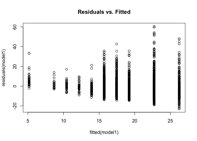
Again, we can see that residuals are not constant and increase as the fitted values increase. In addition to visual inspection, we can also test for heteroskedasticity using the Breusch-Pagan Test from the lmtest package we loaded at the beginning.
bptest(model1)
    studentized Breusch-Pagan test

data:  model1
BP = 76.679, df = 1, p-value < 2.2e-16
The null hypothesis for the Breusch-Pagan test is that the variance of the error term is constant, or in other words, the errors are homoskedestic. By looking at the p-value from Breusch-Pagan test we can determine whether we have heteroskedastic errors or not.
The p-value tells us that we can reject the null hypothesis of homoskedestic errors. Once we've determined that we're dealing with heteroskedastic errors, we can correct them using the coeftest() function from the lmtest package.
Here is a list of arguments for the coeftest() function:
coeftest(model, vcov)
| Argument | Description |
|---|---|
model |
This is the estimated model obtained from lm(). |
vcov |
Covariance matrix. The simplest way to obtain heteroskedasticity-consistent covariance matrix is by using the vcovHC() function from the sandwich package. The result from vcovHC() can be directly passed to coeftest() as the second argument. |
screenreg(coeftest(model1, vcov = vcovHC(model1)))
======================
             Model 1
----------------------
(Intercept)  -5.38 ***
             (1.05)
education     1.76 ***
             (0.08)
======================
*** p < 0.001, ** p < 0.01, * p < 0.05
After correcting for heteroskedasticity we can see that the standard error for the independent variable education have increased from 0.074 to 0.08. Even though this increase might seem very small, remember that it is relative to the scale of the independent variable. Since the standard error is the measure of precision for the esitmated coefficients, an increase in standard error means that our original estiamte wasn't as good as we thought it was before we corrected for heteroskedasticity.
Now that we can get heteroskedastic corrected standard errors, how would you present them in a publication (or in your dissertation or the final exam)? Fortunately, all textreg functions such as screenreg() or htmlreg() allow us to easily override the standard errors and p-value in the resulting output.
We first need to save the result from coeftest() to an object and then override the output from screenreg() by extracting the two columns of interest.
The corrected standard errors are in column 2 of the object returned by coeftest() and the associated p-values are in column 4:
corrected_errors <- coeftest(model1, vcov = vcovHC(model1))

screenreg(model1,
          override.se = corrected_errors[, 2],
          override.pval = corrected_errors[, 4])
========================
             Model 1
------------------------
(Intercept)    -5.38 ***
               (1.05)
education       1.76 ***
               (0.08)
------------------------
R^2             0.16
Adj. R^2        0.16
Num. obs.    2989
RMSE            9.50
========================
*** p < 0.001, ** p < 0.01, * p < 0.05
Using pipes with dplyr
Suppose we wanted to sort the observations in our dataset by income within the respective gender groups. One approach would be to subset the dataset first and then sort them by income.
Without dplyr the solution would look something like this:
First we'd have to subset each category using the subset() function.
cps_men <- subset(cps, gender == "Male")
cps_women <- subset(cps, gender == "Female")
We could then sort by income and show the top 5 for each category:
head(cps_men[order(cps_men$income, decreasing = TRUE), ], n = 5)
     age gender education   income
135   30   Male        16 83.17308
2000  30   Male        16 82.41758
1905  30   Male        16 76.92308
1152  29   Male        16 75.91093
2627  30   Male        16 75.00000
head(cps_women[order(cps_women$income, decreasing = TRUE), ], n = 5)
     age gender education   income
1675  30 Female        18 74.00000
1330  30 Female        16 65.86539
2495  30 Female        16 65.86539
1780  29 Female        18 60.57692
348   30 Female        18 57.69231
This solutions isn't all that bad when dealing with a categorical variable of only two categories. But imagine doing the same with more than two categories (for example, dozens of states or cities) and the solution becomes unmanageable.
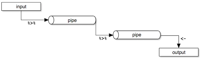
Dplyr makes it easy to "chain" functions together using the pipe operator %>%. The following diagram illustrates the general concept of pipes where data flows from one pipe to another until all the processing is completed.
The syntax of the pipe operator %>% might appear unusual at first, but once you get used to it you'll start to appreciate it's power and flexibility.
We're introducing a couple of new functions from dplyr that we'll explain as we go along. For now, let's dive into the code.
cps %>%
  group_by(gender) %>%
  top_n(5, income) %>%
  arrange(gender, desc(income))
Source: local data frame [10 x 4]
Groups: gender [2]

     age gender education   income
   <int> <fctr>     <int>    <dbl>
1     30 Female        18 74.00000
2     30 Female        16 65.86539
3     30 Female        16 65.86539
4     29 Female        18 60.57692
5     30 Female        18 57.69231
6     30   Male        16 83.17308
7     30   Male        16 82.41758
8     30   Male        16 76.92308
9     29   Male        16 75.91093
10    30   Male        16 75.00000
- First, the
cpsdataframe is fed to the pipe operator. - Then, we group the dataset by
genderusing thegroup_by()function. - Next, we call the
top_n()function to get the top 5 observations within each group. - Finally, we sort the results by
genderandincomein descending order.
Exercises
Download the Massachusetts Test Scores dataset from the link below:
Download 'MA_Schools.csv' Dataset
The dataset contains 16 variables, but we're only interested in the following:
| Variable | Description |
|---|---|
| score8 | 8th grade scores |
| stratio | Student-teacher ratio |
| english | % English learners |
| lunch | % Receiving lunch subsidy |
| income | Average district income |
- Fit a model to explain the relationship between percentage of english learners and average 8th grade scores.
- Plot the model and the regression line.
Check for correlation between the variables listed above to see if there are other variables that should be included in the model.
- HINT: There are some missing values in the dataset. Add the
use = "complete.obs"oruse = "pairwise.complete.obs"argument when calling thecor()function. Use online help for more details.
- HINT: There are some missing values in the dataset. Add the
Add two variables from the list above that are highly correlated with both the independent and the dependent variable and run linear regression again.
- Compare the two models. Did the first model suffer from omitted variable bias?
- Plot the residuals against the fitted values from the second model to visually check for heteroskedasticity.
- Run Breusch-Pagan Test to see whether the model suffers from heteroskedastic errors.
- Correct for heteroskedasticity (if needed) and present the results with corrected standard errors and p-values.