 Close
Close

Blog: A design sprint for new climate change metrics
2 December 2022
A look at recent developments in our project to develop new metrics to communicate what climate change looks like now
The climate risk metrics project
Creating new tools that help us communicate and understand climate change is an important step towards meaningful action on this issue. Metrics are one such tool - they are widely used to build narratives and to evaluate change over time.
During Covid-19, the R-number allowed communicators to quickly inform the public of how the crisis was evolving. In the UK, at least, it was the go-to metric for reporters and politicians. Now, the Climate Action Unit (CAU) is taking learnings from the global health emergency and applying them to the way climate change is discussed.
Practical, impactful metrics
During the past 18 months, the CAU has worked with a range of experts to ascertain which metrics would have the greatest positive impact (and which would be most practical to use) for those engaged in communicating climate change. The metrics also needed to contextualise climate change within people's everyday lives.
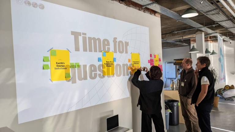
Through a series of workshops and discussions, the following three metrics were selected:
- Earth's energy imbalance
- Rate of temperature change
- Unusualness of weather
The CAU gathered data for each of these metrics from scientists at NOAA, Berkley Earth and Newcastle University and, working with Data4Change, convened a multinational group of designers from 4-6th November 2022 to create visual representations of the metrics.
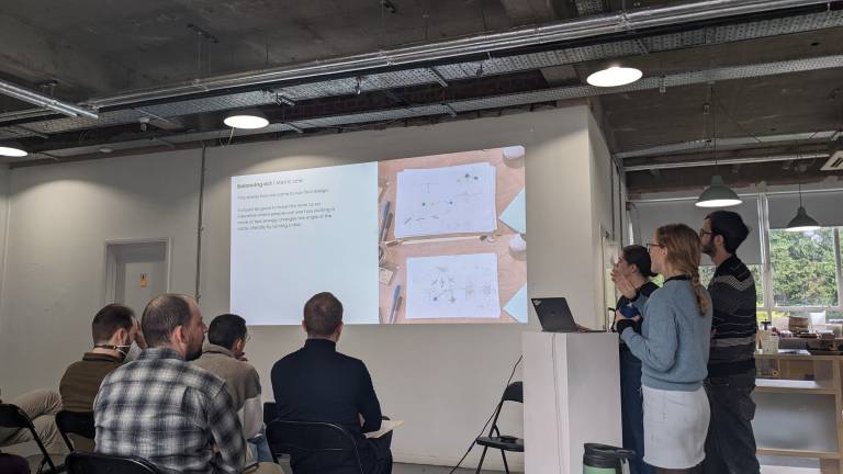
Climate science + creatives: the design sprint
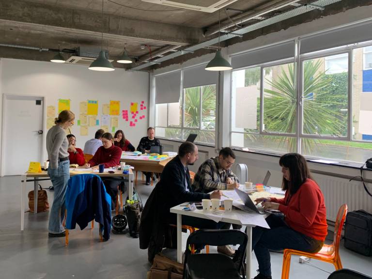
At a venue in Walthamstow, London, designers were split into three teams and set the task of creating visuals for the metrics so that they could be used by the media, policymakers and the wider public.
At the start of the sprint, teams were given time to ask questions about the metrics and gain a good grounding in the key scientific concepts. Next, they undertook a series of brainstorming sessions to generate ideas on how best to communicate the concepts - featuring lots of drawing and mind-mapping.
In the second half of the sprint, the teams built and refined their protoypes before presenting them - as can be seen below. At the end of the design sprint, three families of metrics were ready to take for audience testing.
CAU Project Assistant, Annie Risner, noted:
"It was incredible to see what could be achieved in just two days with three different visualisations - all of which will now be taken for testing with the media and wider public, before the final trio is released for use next year."
Check out this video created by Data4Change to see the sprint in action:
At our latest sprint, we collaborated with scientists from @UCL_CAU and creatives from our network to explore how to communicate 3 new (and much-needed) climate change metrics. We can't share the prototypes publicly just yet...but we can tell you they are flippin' AMAZING! pic.twitter.com/rS7DtiZYsh
— data4change (@data4change) November 11, 2022
To find out more about the project, visit the Risk Metrics project page
Who are Data4Change?
To find out more, visit the Data4Change website